
My role in the project
Senior UX Designer. Facilitated meetings, workshops, user interviews, and field research. I have conducted tests and analysis of the results and contributed to the prioritization of tasks.
Tools used
Sketch; Bootstrap studio; Pen&Paper; InVision; Mixpanel; Analytics;
The challenge
In SMB the daily check of the bank accounts is crucial, the ins and outs at a glance could mean the success of a small business. Our competitors offered tons of features including dashboards, and we were behind the time. But on the other hand, our product was the only one that could provide an automatic integration with the customer's bank accounts. An overview of daily expenses was for a long time the most requested features from our users.
Primary goal
Help small businesses and self-employed to keep on track and control their accountancy.
Picking up the audience
Medium companies with financial departments or dedicated payable clerks used to have a better understanding of the accountancy tasks. But our focus was to improve the lives of small organisations in the lower level of maturity. These groups represented more than 60% of the MRR of our business at that time. We decided to focus on this audience.
Self-employed
Small business payables clerk
Some context
I started conducting a series of customer interviews to know more about their routine, common pain points, their toolset and their interaction with our current solution. Luckily I had tons of users across the country in my hand. I chose 30 different clients from different sectors and levels of maturity to help me understand better how small businesses and self-employed used to organize their finances.
I started conducting a series of customer interviews to know more about their routine, common pain points, their toolset and their interaction with our current solution. Luckily I had tons of users across the country in my hand. I chose 30 different clients from different sectors and levels of maturity to help me understand better how small businesses and self-employed used to organize their finances.
The research phase was conducted by me under the orientation of a senior User Researcher. Together conducted and recorded more than 30 interviews in 4 different cities. After a month of work, we summarised the most common scenarios and highlighted the insights that could help us to move forward.
Research Insights
The maturity level is related to digital adoption
Small organisations with the manual process were often slow and bureaucratic. The conservative approach towards technology or the digital process was wasting their time.
No trust in the accounting software
Many users couldn’t see the benefit of paying a premium account because they didn't trust the system. As soon as they got any wrong number or result, the engagement decreased quickly.
Communication issues between departments
It was difficult to keep finances in order without bureaucracy. Manual inputs and delay of approvals were blocking sales. No overview of inventory causes delays in delivery and invoicing.
Tracking payables and receivables is time-consuming
The process of using different systems and tools were time-consuming. Clients used to spend hours taking notes in paper then using a spreadsheet to control the daily payables and receivables.
There was a long process for payment approvals
The process of approvals takes many steps, especially in organisations with branches. The approval needed to be tracked and signed for many people. This process was often manual and complex.
Deal with much online banking was stressful
Experience in using online banking in Brazil is pretty bad. Even small organizations needed to deal with many bank accounts in many different systems. This was not even time-consuming but also stressful.
Understanding the business impact through data
The qualitative interviews gave me tons of insights, now was time to understand which feature could generate more engagement. Together with a data scientist and a User Researcher, we evaluated the most common daily tasks such as invoicing, suppliers payment, recording receipts, and payroll.
Something that became evident was the kind of reports users were downloading more frequently. Reports such as Cashflow was a hit, all business was constantly using the reports. There was an opportunity.
Clients who download the cash flow reports on a daily basis had a substantial increase in the retention against clients which downloaded the reports weekly or monthly. Clients who print the payables and receivables daily had more retention than clients who didn’t. The usage of those features was directly related to engagement. Building an overview with those features at a glance could increase the conversion of trials, and help them to keep eye on their finances.
Exploring solutions
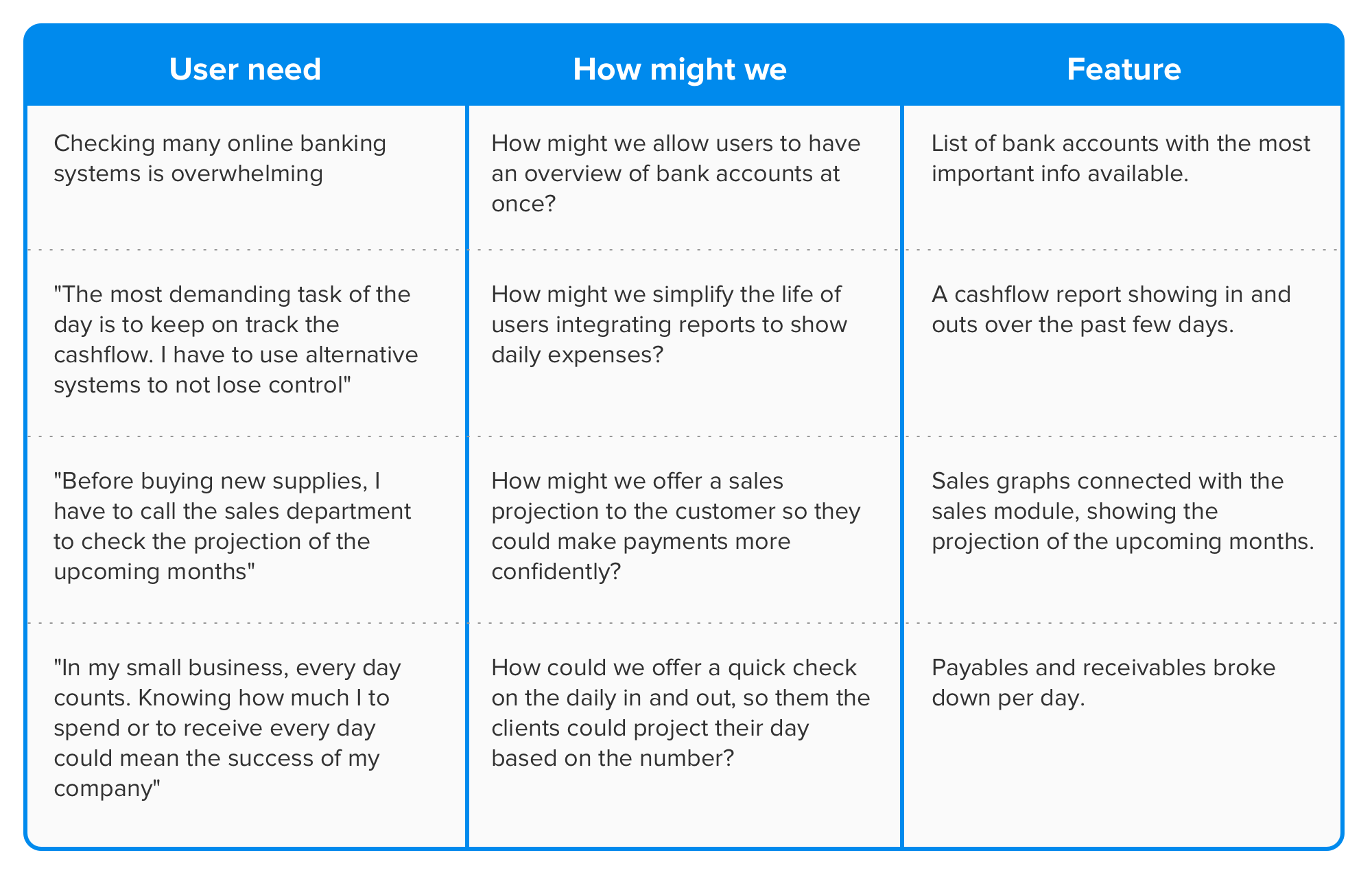
Knowing most of the biggest pain points of our customers, we started to group them by affinity. The goal was to not invent any new feature, but display information we already have in the system, in a way that could save the time of users.
Strategy
Our team was only responsible for banking modules on the system, we had constraints like resources and expertise to deal with a dashboard. We had to set some realistic boundaries and commit to delivering.
Start with an external library of charts
Graphs were too complex to build. Giving the uncertainty of the adoption and success of the solution, we should use simple charts in the beginning to visualize data.
Keep the eyes on the most critical problems
We should keep it simple, focusing on saving time from user that often lose track of their finances. Avoiding extra work or transforming a dashboard into a collection of widget, we should prioritize the main tasks our clients should accomplish.
Use existent data
We should pull data from the existent platform, reports and modules. Only surface the right and contextual information in a simple way to make sense to users.
Simplify the communication
The biggest chunk of our users had no deep understanding of accounting. We needed to simplify as much as possible the communication points to build trust and engagement.
Wireframing
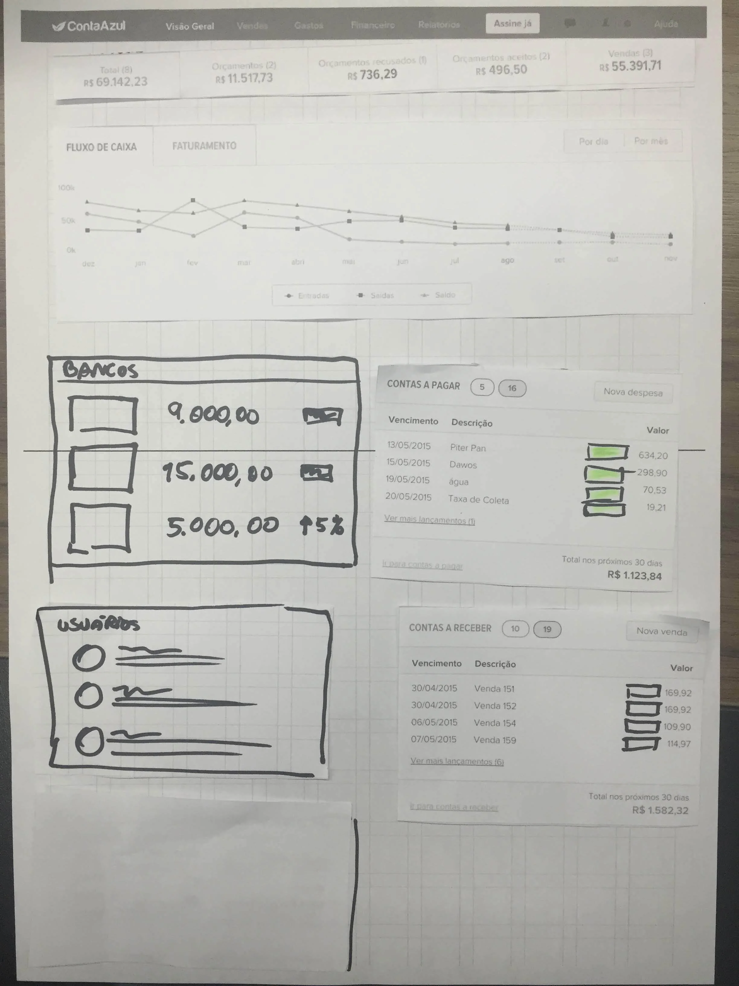
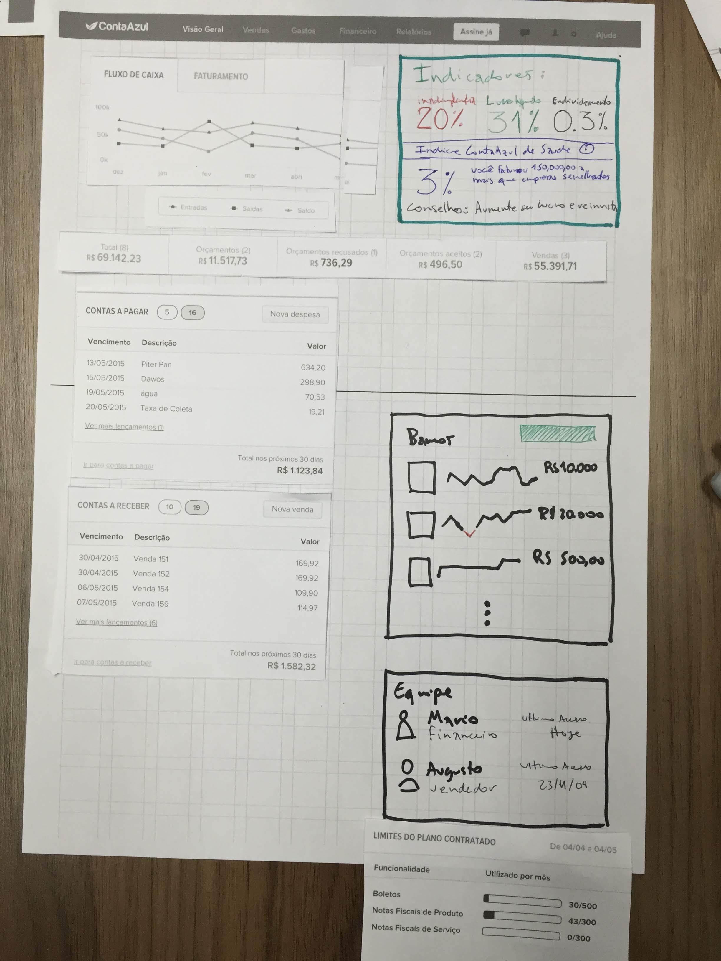
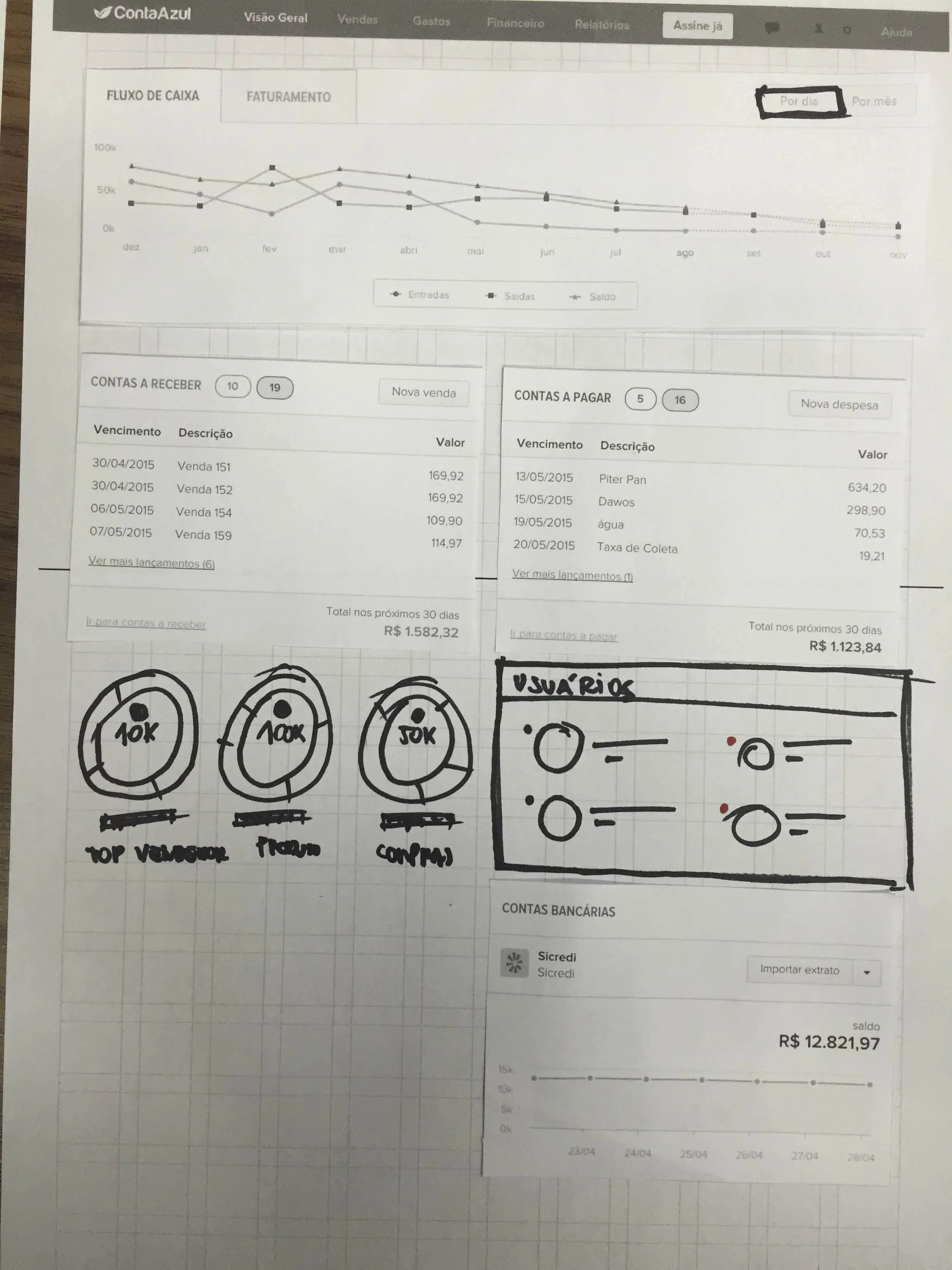
I decided to create a session with the team to draw wireframes. It could save me the time of studying references that would be impossible to implement. We analyzed the problems and drew some possible solutions. By the end of the session, we had an idea about how it could look like.

Prototyping
At ContaAzul we had a Design component library built with Bootstrap studio. This allowed us to use a component with the same behaviuor as used in the platform and test prototypes with extreme fidelity and accuracy. There was a guild responsible to keep the component library that fed front-enders and also designers.
As the dashboard used almost only new components, the risk of building something from scratch and waste time was high. So I decided to test with static prototypes and collect evidence for a possible new round of iteration.
After 1 week I had a clickable prototype made using InVision and Sketch.
Validating with users
The test started with a Guerrilla testing with 10 participants who weren’t familiar with the system. The plan was to test their ability to understand the information in the order and place I was showing. I gave them some small tasks such as calculate the total amount of money in the bank accounts and check if there was any supplier to be paid that day.
Having received positive feedback from the first round of tests, I iterated and prepared to test with accounting clerk. This round of 12 tests was supervised by a User Researcher, with more complex tasks and scenarios. We had to build 3 different clickable prototypes to support the scenarios. The results were really interesting, but we saw many flaws in the flows.
Some of the main insights we collected were:
Delayed receivables were critical
There was no evident way for users to know if there were receivables delayed. Users could easily lose sight of delayed receivables.
Some people should have limited access
We had to consider connect entitlements to hide specific information from the overview. Information such total amount in the bank accounts, or the total amount of receivables of that month, shouldn’t be available to everyone.
Testing with real data
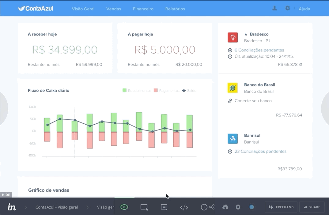
After many rounds of tests, we started a proof of concept of the product. We build the HTML dashboard using Highcharts. The micro-interactions of the components weren’t entirely validated, so there was a gap in the experience we wanted to mitigate before invest time building the entire components.
We used Intercom to broadcast the beta campaign and collected results with Google Analytics and Hotjar. The feedbacks came from everywhere, in 1month of the campaign we had a backlog of improvements and many insights we should focus on. Fortunately, the biggest complaints were related to technical issues due the poor components and dirty code we used to pull the information from the reports. But in general, the main scenarios and problems we approached were connected to our solution.
The outcome
After two months of constant work, we finally had the final version of the Dashboard.
Improvements
Besides the technical issues, we found some interesting insights that could enhance the experience of the users.
Educating users
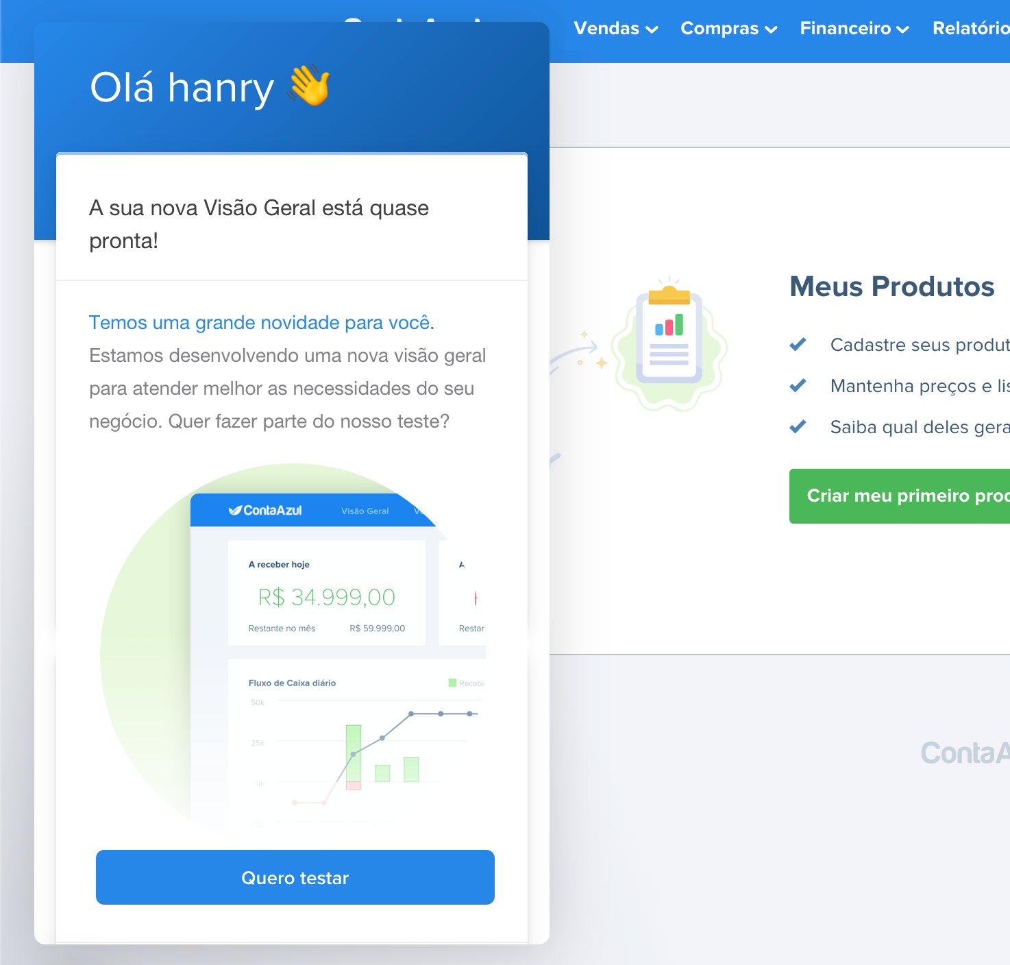
The biggest issue in the accountancy of small organizations was the bureaucracy and lack of communication. We could explore these issues providing pre-cooked dashboards for specific types of organizations, with pre-populated data, for users to understand how their organization could benefit from connecting invoices or bank accounts.
Onboarding opportunities
We found an opportunity to show quick actions to users send their first invoice, or make their first banking integration. It improved the retention once users now felt compelled to start using other modules of the platform.

Learnings and results
Accounting in Brazil is a complex and manual process, the lack of digital integration from banks, governmental institutions, financial institutions, open doors to bureaucracy, excessive paperwork, and fraud.
Keeping track of many aspects of accounting while you need to grow revenue and survive was the reality of many of our users. The dashboard became the place where all of this information made sense.
After 3 months of V1 release, we saw a substantial increase in the user retention. The biggest amount of traffic in payments, receivings and cashflow reports, came from clicks in the dashboard. Another positive result was trials who used the pre-populated demo mode converted 2x faster into premiums. It shows we were educating users.
Some secondary numbers were also very positive. Banking integrations grew from 24% to 38% for trials. The total amount of receipts recording increased by 13%. The user base who never used payables or receivables modules reduced 10%. And the most interesting numbers were related to delayed receivables. Delayed receivables with more than one month reduced by 52%.
These numbers gave us the evidence we were helping small businesses to have control of their accountancy.

Recommendations
Hanry has a great ability to communicate his findings and captivate people to work with him. Because of his empathetic character he was always a great add to the User Research initiatives at ContaAzul. His deliverables are precisely aligned with the expectation of the team and the organisation.
Marcella Medeiros - UX Researcher Lead at Cognizant