
My Role
As a designer lead I was responsible for all design, user research, usability testing, and dev handoff.
Tools
Figma, Lookback, Miro
About Click2pay
Clik2pay's innovative service lets customers easily pay from their bank account by text, e-mail or QR code. Clik2Pay provides a long-awaited alternative to expensive options like credit card and cheque, and legacy systems such as the existing bill pay network and pre-authorized debits.
Highlights
App was redesign and relaunched in 4 months. It's currently available to use in Canada and US. Link for the article: https://clik2pay.com/2022/11/09/clik2pay-relaunches-clik2pay-mobile-app-for-small-business-fr/
Research on regulatory compliance gave our team important insights to shorten a long and tedious registration form making it more appealing and reducing critical frictions in the customer activation funnel.
The challenge
Canada's regulatory environment for digital payments poses significant challenges. Small businesses are tied to outdated and expensive solutions from traditional financial institutions, where fees are high and UX is often overlooked. The new Interac e-Transfer protocol allows financial institutions without banking licenses to operate in the transaction business, enabling innovation.
Click2pay aimed to pioneer a solution for small businesses, offering lower fees than competitors. However, users faced numerous barriers with the previous mobile app, resulting in high dropout rates. Few customers who registered returned to use the app.
Objectives
Relaunch the mobile app for iOS and Android devices.
Improve UX in critical areas such as the registration form, which was too lengthy and caused users to drop out before completion while maintaining regulatory compliance questions.
Introduce a new feed of transactions showing different payment statuses.
Adhere to a new rebranding of the desktop website with updated colors and fonts.
Research
Investigated compliance regulations to simplify the onboarding process while adhering to legal requirements.
My team dedicated a good amount of time to studying similar established products and their operation within the payment regulatory environment.
It was analyzed how the new branding could align with both iOS and Android mobile design guidelines.
Investigated data related to drop-offs to understand why users were not completing registration.
Mapped out user journeys to identify activation points and increase registrations.
I mapped the main flows of the app. My team added questions that we should investigate during the research phase.
I had the opportunity to speak to a few of the active users of the platform and I got some key insights.
Not clear value proposition and market fit communicated during the onboarding process
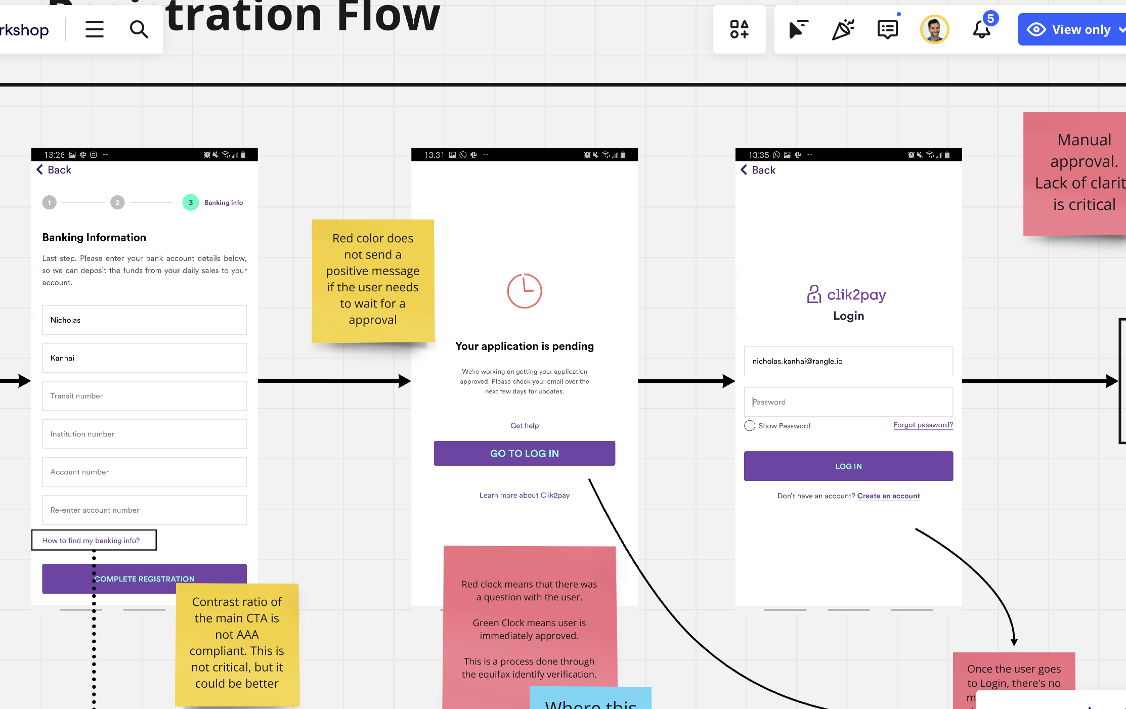
Users had to wait to register and this was causing users forgetting to come back to the app. Approval of the business registrations could take up to 48 hours and the process was not transparent.
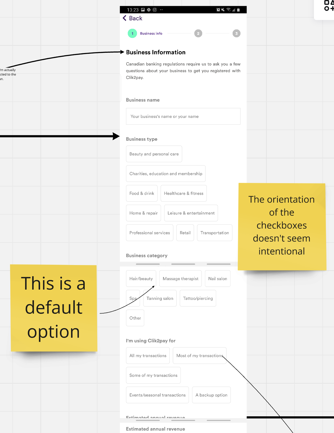
Mandatory regulatory questions were often disregarded and users didn’t see the value in answering it. The drop-off rate in this section was the highest.
A major concern on accessibility of the CTA’s. Users found it difficult to read.
Accessibility issues on the input fields caused users to make mistakes while inputing banking details.
Step by step guide on the previous app
Business details screen
Solutions
Information Architecture
Reorganized and simplified the registration process, removing unnecessary steps and introducing a new path for different user personas.
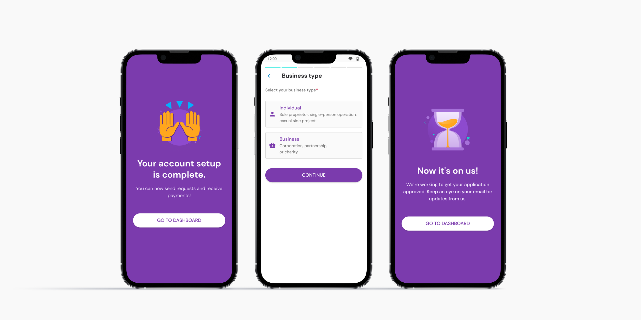
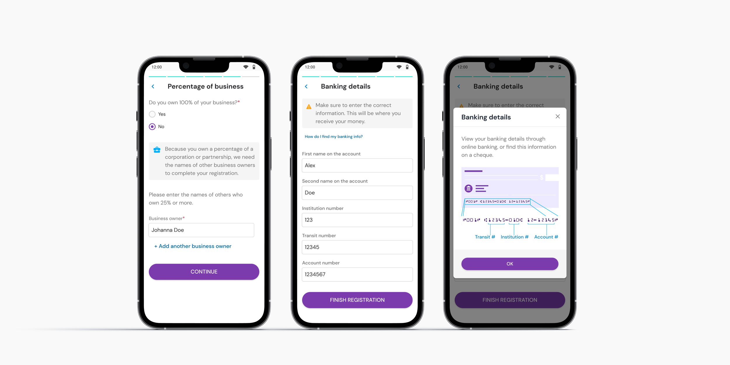
Split the registration flow into two paths: one for individual merchants (who could use the app immediately) and one for business merchants (requiring approval).
A definite advantage for us was the absence of a lengthy wait (up to 48 hours) for approval on one of the routes. This meant that individual merchants were able to immediately utilize the app. Consequently, this led to a 60% decrease in user friction for the app.
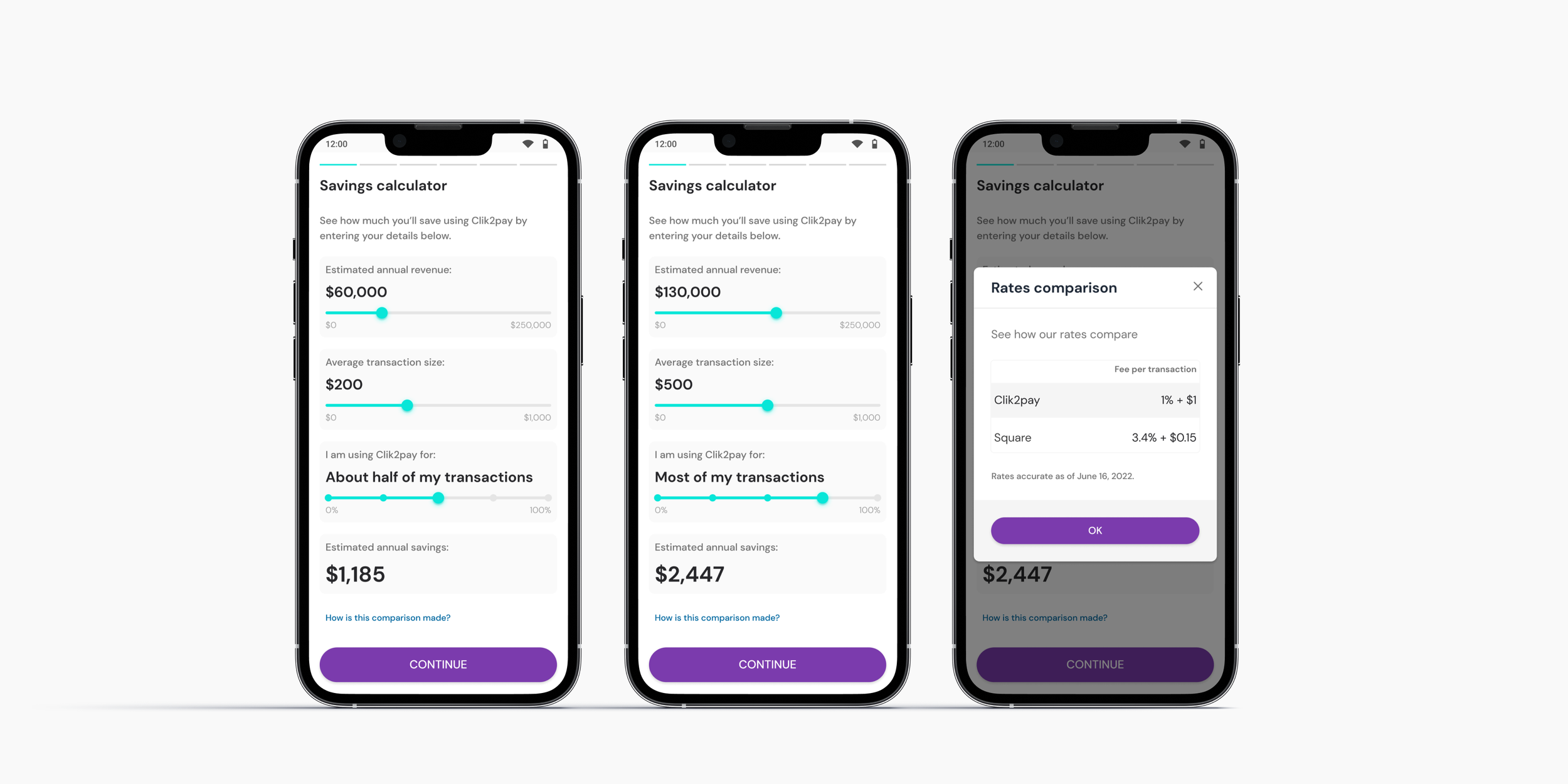
We proposed transforming the mandatory questions into a saving calculator. This way the users could see the value of inputting data. This was a major win for the step with the biggest drop-off rate.
This way we could make use of the user-required information and turn it into something valuable for them. The savings calculator was a way to mitigate the risk of using dropping for the lack of engagement.
The calculation was compared with the main competitor from Click2pay, Square.
Accessibility issues on the registration form solved and new branding colors applied.
After extensive research regarding banking registration process in North America our team proposed a solution that could support users both in Canada and also in the US.
To reduce friction on the baking details input and reduce errors, we introduced a modal explaining how users could find this information easily on a cheque.
Validation
Conducted evaluative research using Lookback to gather qualitative insights on critical steps like banking and business details.
Preliminary Results
The time to complete registration for both individual and business merchants dropped significantly.
The success rate for inputting banking details increased considerably with the new design.
Users mentioned the app's value proposition was still unclear.
Iterations
Increase the communication of the value proposition along the registration. Have a few break steps in between to motivate users to continue the registration. This was a hypothesis on how to increase engagement.
Adjust the communication to align with some of the most sought business types for the individual merchants, such as Yoga teachers and contractors in the construction industry.
The onboarding screen should be dismissable in any point. We did not want to block the user at this stage because there was a long registration form ahead.
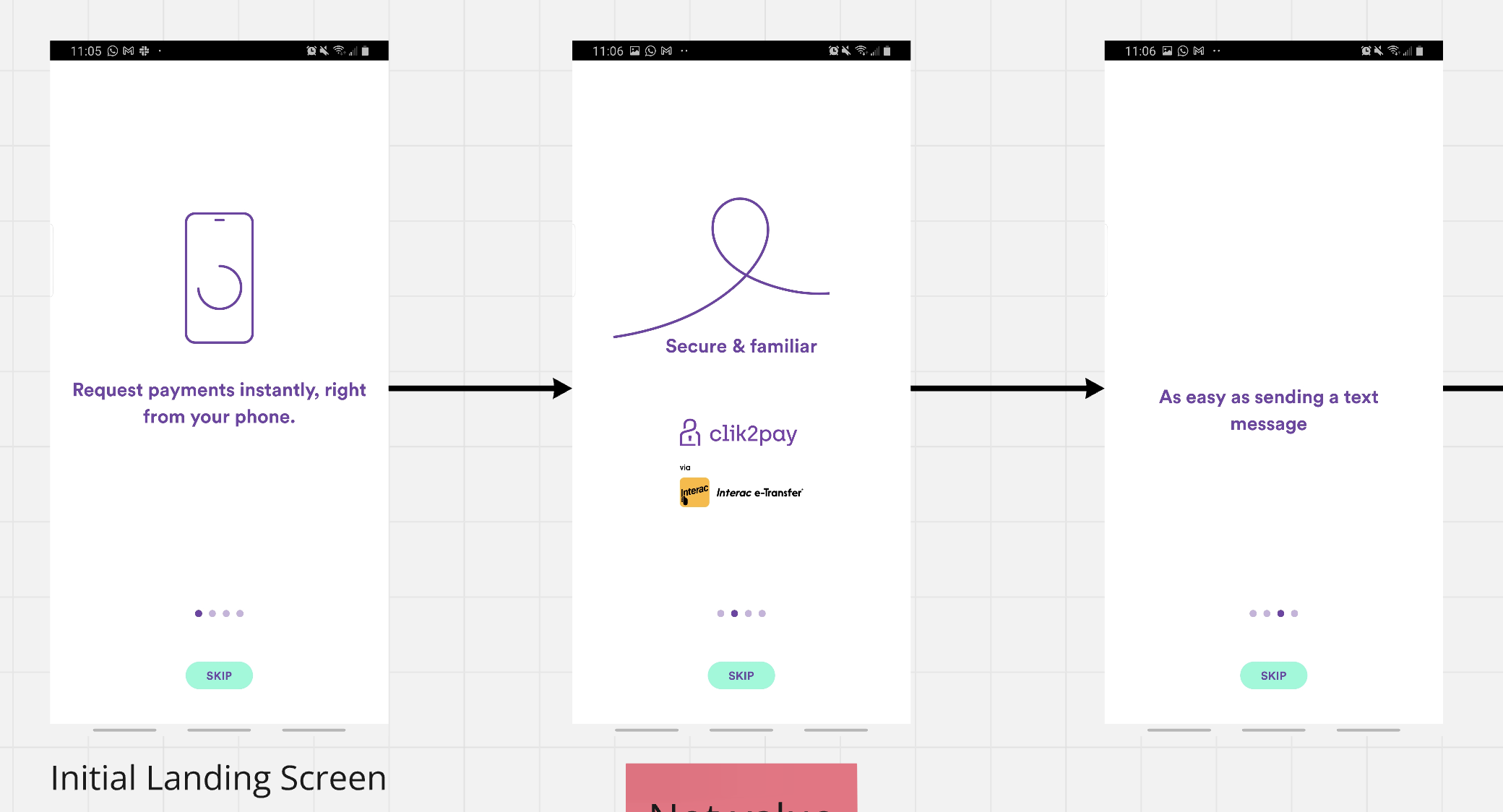
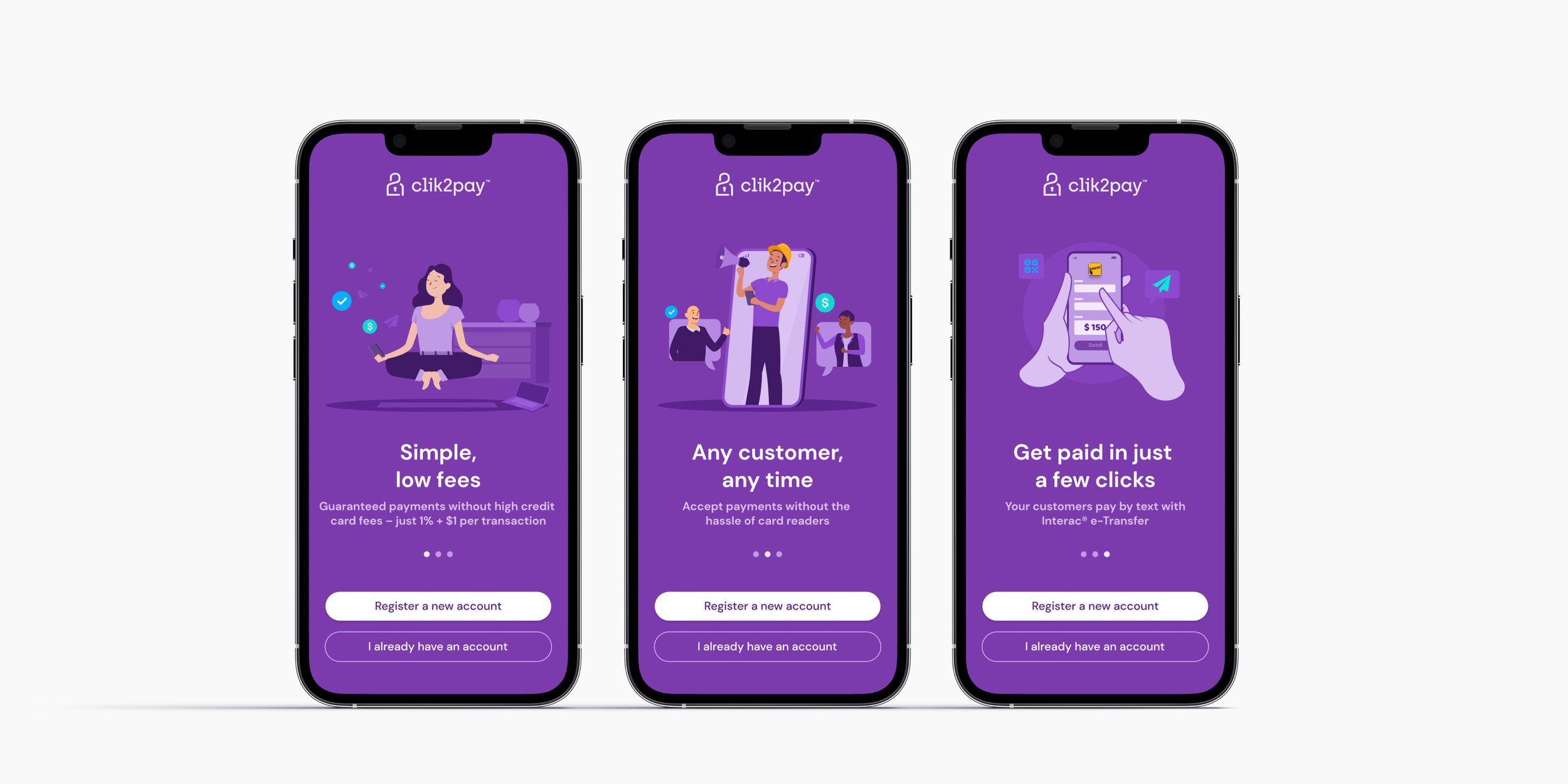
All the illustrations and visual assets were created by me.
We considered the option of implementing a step by step onboarding guide after the registration to help users concentrate on the value prop and simplicity of the solution.
This pop-up should appear after the user start performing any action after the registration.
Backlog items we could solve during the project
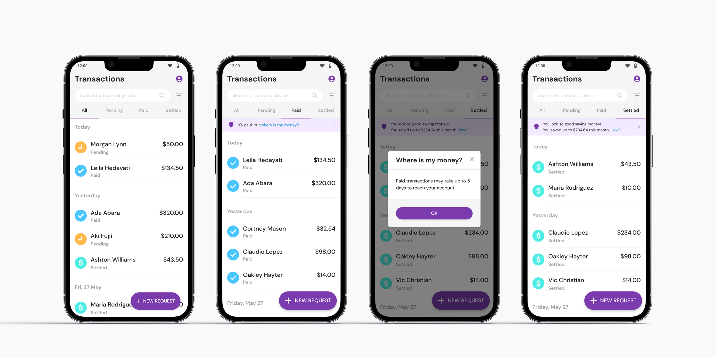
Users couldn’t understand where they money were going to. Payment was concluded but money was not in the account.
New dashboard proposed with the settled section introduced. This could potentially reduce the ambiguity on payments vs settlements. New iconography designed for the different statuses.
FAB introduced in a way to reduce visual clutters while scrolling on the list.
New way to group transactions by date on the “All” tab.
Learnings
This project was heavily influenced by the regulatory complexity on the North American payment system. This was a challenge for a person who is used to designing for European financial institutions.
Results
Click2pay app is currently available in Canada and US.
The business has been expanding to approach different audiences and use cases such as nonprofit organizations with door-to-door donations.
The redesign was a success and most of the designs were reused on the redesign of the new desktop platform.
Please check more details of the website for small business: https://clik2pay.com/small-business/