
My role in the project
Senior UX Designer/ Consultant. Facilitated meetings and workshops, collaborated with User Researcher, responsible for UI deliverables and component library.
Tools used
Sketch; HTML; Pen&Paper; InVision; Android studio;
The challenge
Tasy Hospital web app was a huge and complex application. Difficulty to use was causing delays on the attendance on critical moments.
Making a mobile application lowers the cost and facilitates access to vital patient information and save lives.
How did we know this was a problem?
The doctor needed to know the patient's vital signs combined with the patient's history to provide quick medical care.
In Brazil doctors lack the necessary and basic tools such computers or digital displays.
Even high quality medical institutions reported problems of delaying of attendance caused by manual process.
How could we use mobile devices to Improve decision making inside of the hospital?
Secondary Research
The first approach was to collect insights from thousands of documents that Philips held about the Electronical Medical Records universe. The objective was to gather knowledge and context about trends, needs, opportunities in this industry.
My team generated a secondary research report of insights that would affect future business decisions.

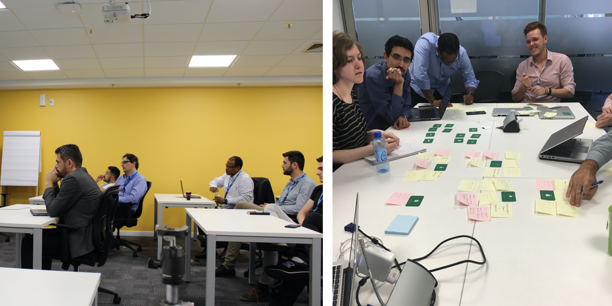
Workshops with stakeholders
Philips is a huge company, and Tasy is a very complex product, our team wanted to make sure that all the decision-makers were aware of the challenges we were facing ahead. The workshops aimed to discuss possibilities, risks, and limitations related to mobile platforms. The participants of the workshops included design, tech and dev directors, product managers, and business analysts.
The challenge at this moment was to inform stakeholders that there was a considerable risk merely building an app with the same functionalities as the desktop version. It could compromise the experience of the product entirely. Using the Mobile App Method kit, we highlighted and simulated all critical aspects for developing an app in iOS and Android.
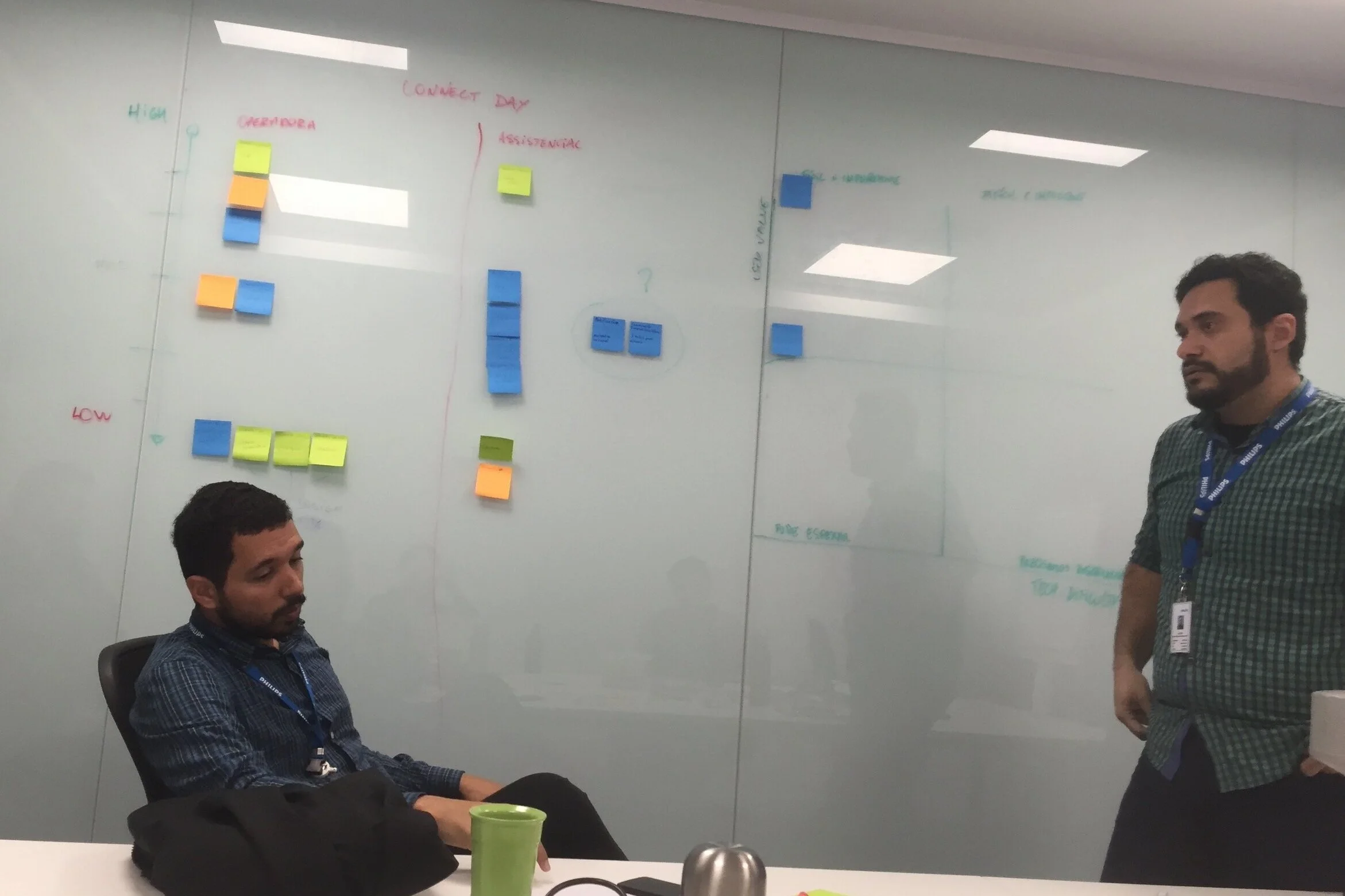
Prioritization
After challenging discussions, we agreed to define specific scenarios for mobile platforms and create a lean roadmap, in which we could learn from the beginning, focusing on the primary personas and their tasks. Using the “Risk vs. Reward” scale, the team discussed each feature possible feature, and after positioning it in the range of the various risks vs. the value. It revealed what’s easy or challenging to do and essential or not for users.
The result was a quadrant with the priorities for a short term strategy. We reduced the scope to go to the market and collect results as soon as possible.
The emergency process was the most rewarding opportunity we could approach.
The biggest risk was the compliance issues by showing patient records.
Focus on Android version first. Most part of our audience was using Android devices.
Sizing the solution
Understanding the size and complexity of the solution.
Refining the scope and focus on the priorities to the MVP.
Prioritize Vital Signs overview in case of emergency.
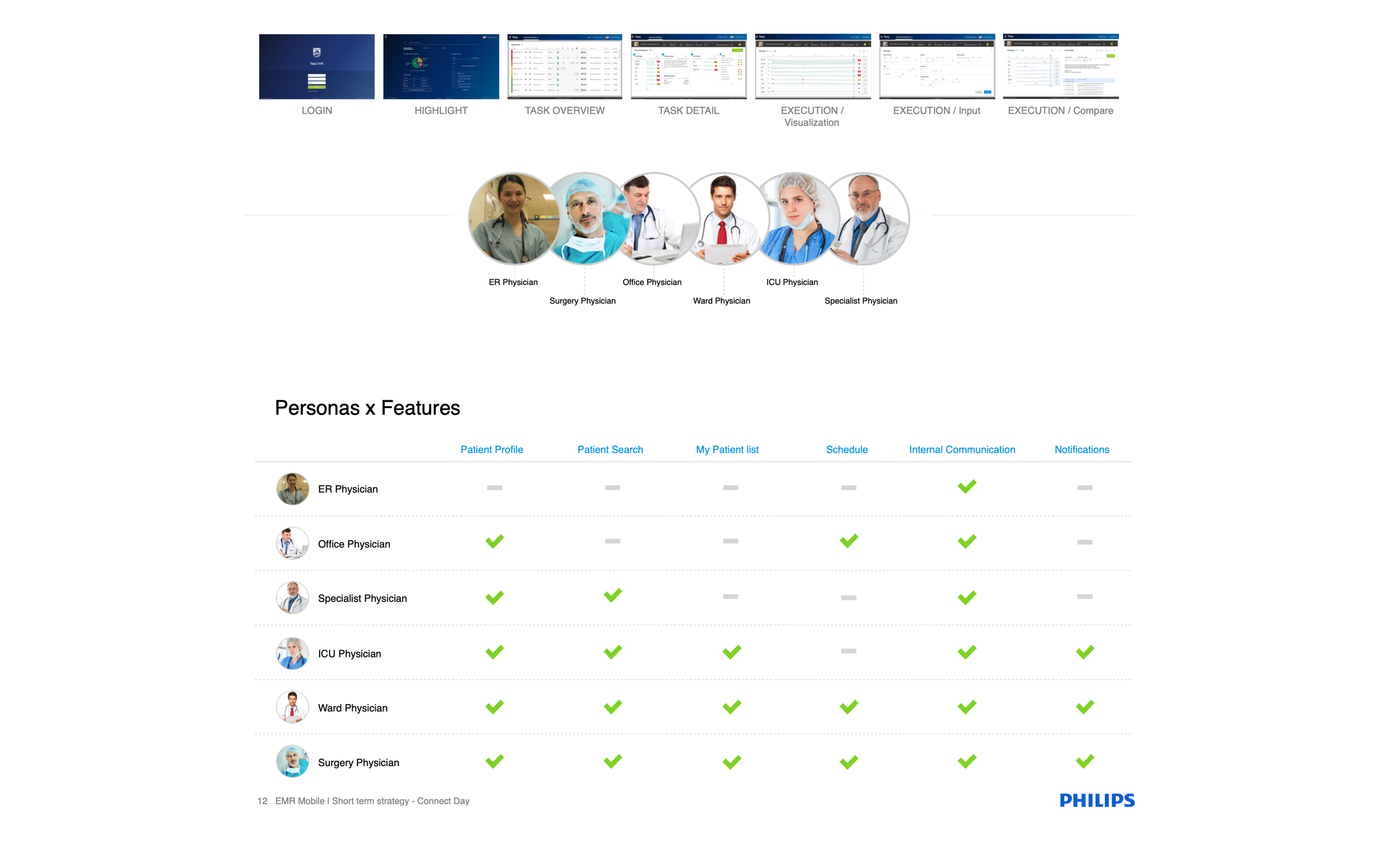
Building personas
For this project, we had the luxury to have many specialists prompt to help and validate the information. After dozens of interviews and some in site visits, designers and researchers worked together, compiling a massive amount of data collected during the exploratory research phase. The goal was to create feasible personas and archetypes that could help to prioritize the future roadmap of the product.
Based on all the data collected, our team found six main archetypes and 48 different personas. Each of them had different needs and tasks in the healthcare environment. The solution should aim to provide contextual information to improve decision making, so we focus on the personas that needed medical records at a glance. This quick access to information could not only be beneficial but also save lives. Together with business analysts and project manager, we decided to focus on six main personas that had the most critical role during an emergency.

Project Definition
After Involve the Stakeholders and find the right size of the solution, our team defined the main goals of the project.
Project goals
Aggregate patient information that was passed on paper and from one person to another through a unified system that can be used throughout a emergency or several visits.
User goal
Being able to check vital signs and patient records during the emergency.
KPI's
Number of active user sessions per month
Due compliance issues we could only focus on the monthly sessions.
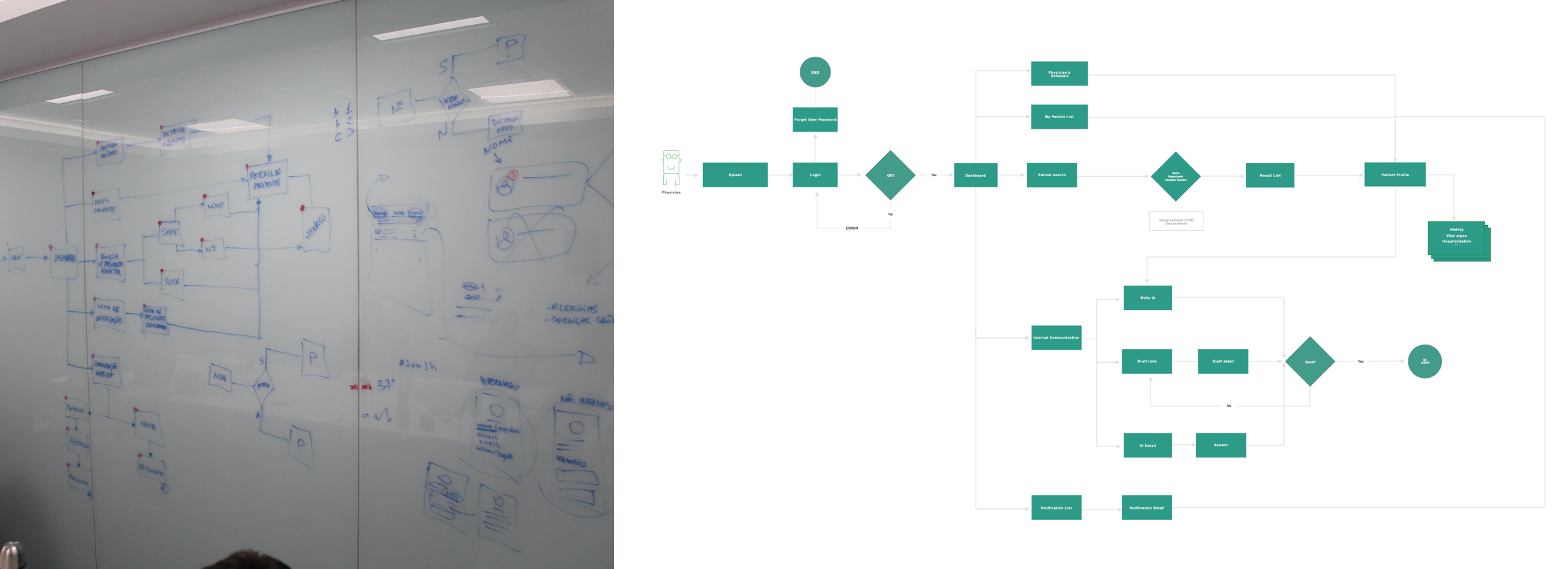
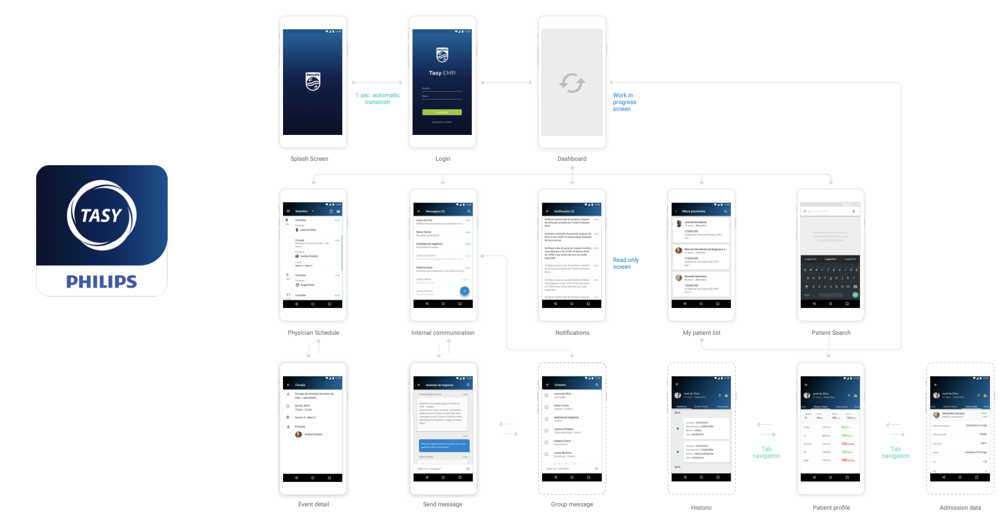
Information architecture
Using the information collected before the team designed the main site map of the solution. With the sitemap in hands we could focus on the main scenarios and design task flows. We used a large wall to draw the flows and validate with specialists. The digital version of the tasks flows was shared with stakeholders and decision makers using InVision. Using this approach we could collect and concentrate critical inputs. This exercise help everyone to understand the size of the complexity of the solution. After some iterations we agree to refine even more the scope, with the small team of developers we would take much time to build all the flows.
After defined, the flows became epics in which we broke down in many user stories. The scrum master allocated the team, and the product owner started to setup database calls and api's integrations.
ER physicians (battlefront) couldn't use mobile phones.
Patient record and information was only available preliminary medical check.
Prioritize Vital Signs overview in case of emergency.
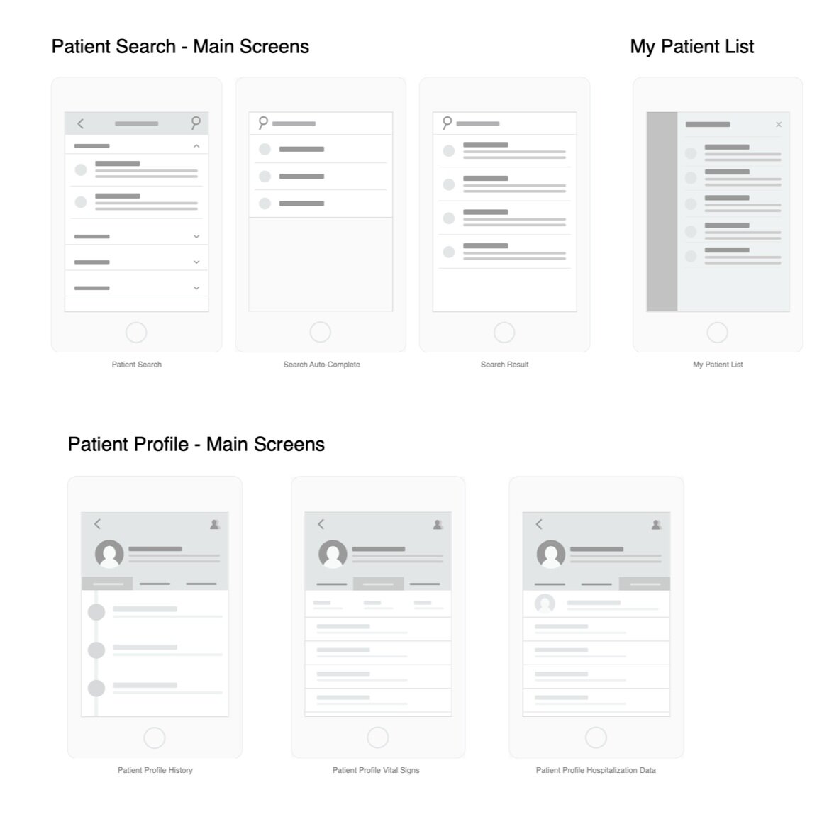
Wireframing and validating
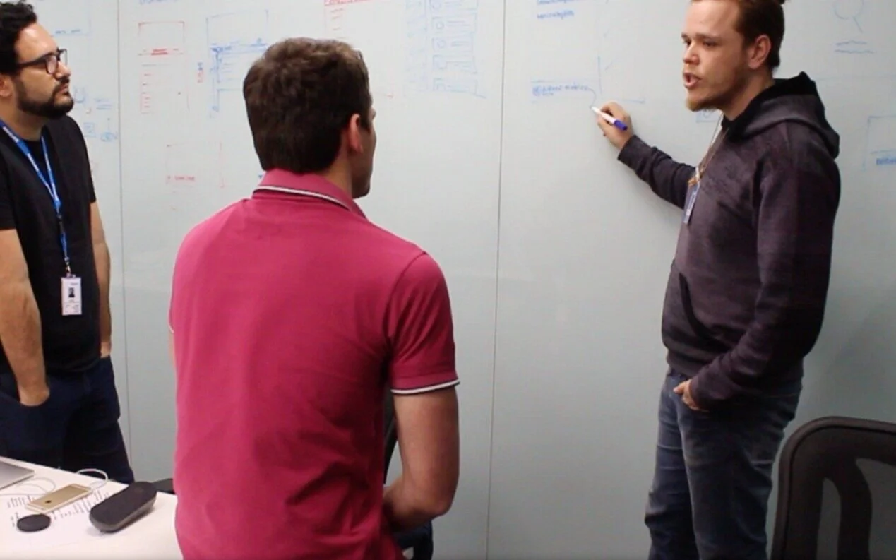
Low fidelity wireframes on the wall to validate and engage with experts.
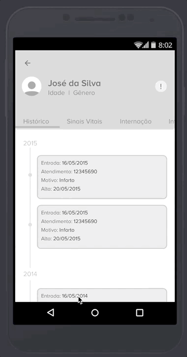
With these sessions I could find opportunities on how to show vital signs in real time, and patient history in a timeline.
Prototyping and testing
For the concept validation, we decided to use only moderated methods. One designer and one user researcher moderated all the 18 sessions. The tests took place in a nearby hospital. We build the main flows in InVision, and the researchers helped the team to write a test script. For 3 of the primary personas, we had the opportunity to observe the test in person. For the others, we used the Lookback app. The tests showed us many flaws and dead ends in the flow. After some iterations, we agreed to close the scope and start the development and the visual design phase.
Getting validation from physicians
Low fidelity wireframes to validate interactions and flow with users
I could test the prototype with three main personas in a nearby hospital.
The test helped me to validate the flow and to figure out I had to improve the size of the icons and the color of the fonts to be easier to scan during an emergency.
Key takeaways
Keep the patient information on the top to help on the decision making.
Add relevant information such as quarantine or allergy on the top bar.
The session should expire if the user leave the hospital.
The main visual Challenge
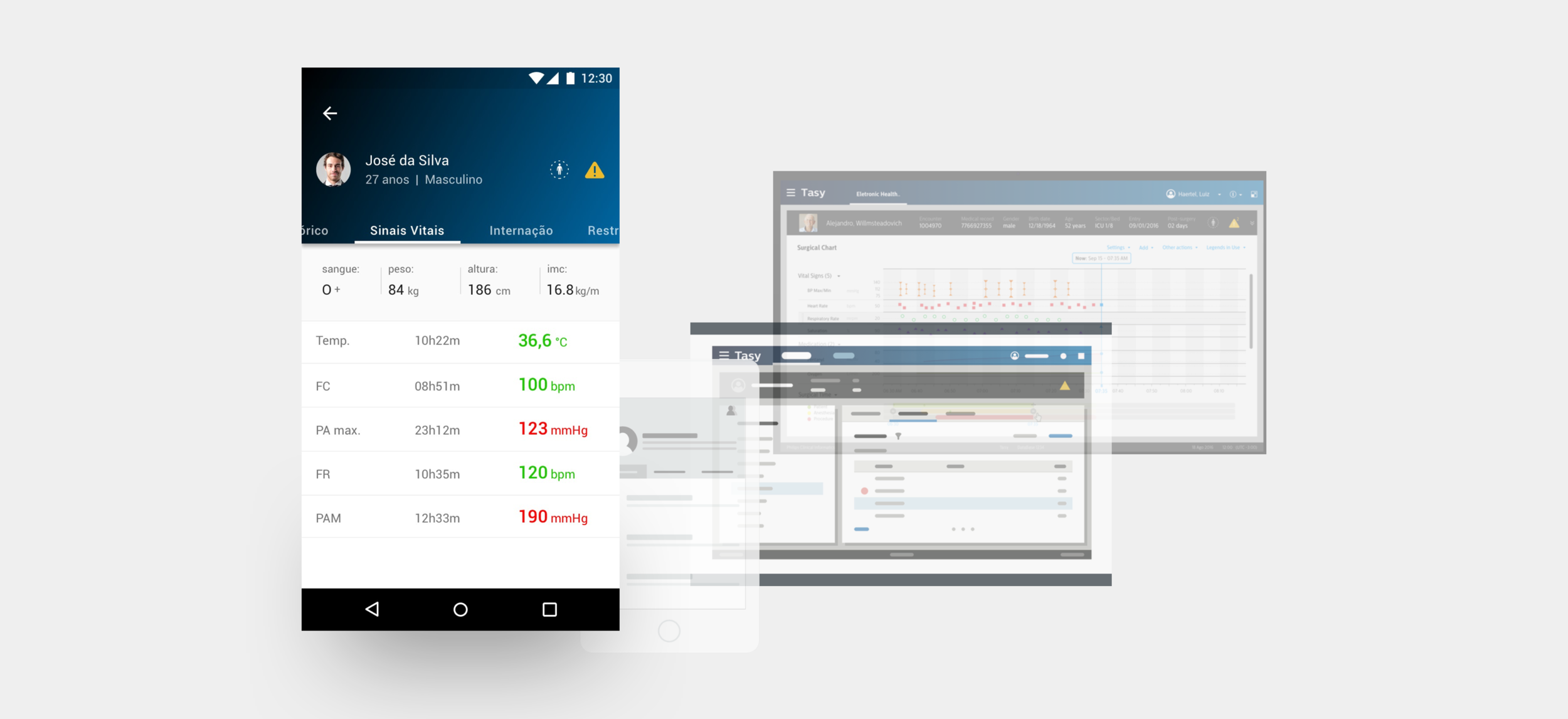
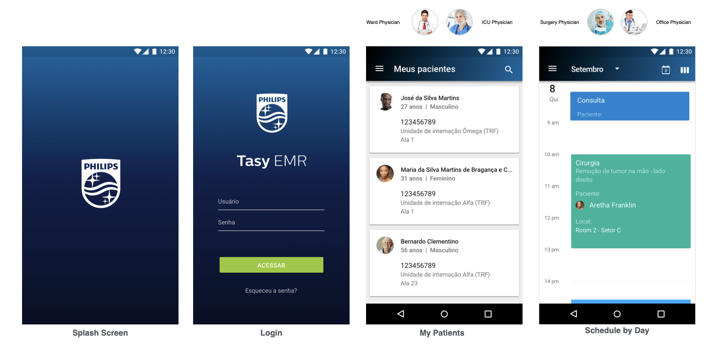
The most challenging part of the visual design was to translate the patient information from a complex web version to a small smartphone screen.
I made hundreds of iterations before getting to a satisfactory result. Most of the iterations were validated with the internal team and physician specialists. The idea was to show at a glance the necessary information to help the physician during the patient check.
Visual design
After iteration sessions on the prototypes, we started to build the final style of the app. The visual design phase was the most enjoyable phase of the project. All the business decisions were made, the stakeholders were involved and aware of the results, we had validation from experts and users, and we had the development team already working on the back-end. The challenge here was to apply both Tasy and Philips brand guidelines. Philips had a wide variety of branding assets to support designers, but mostly for desktop and displays. Our team had to build an entirely new style guide and components to this app.
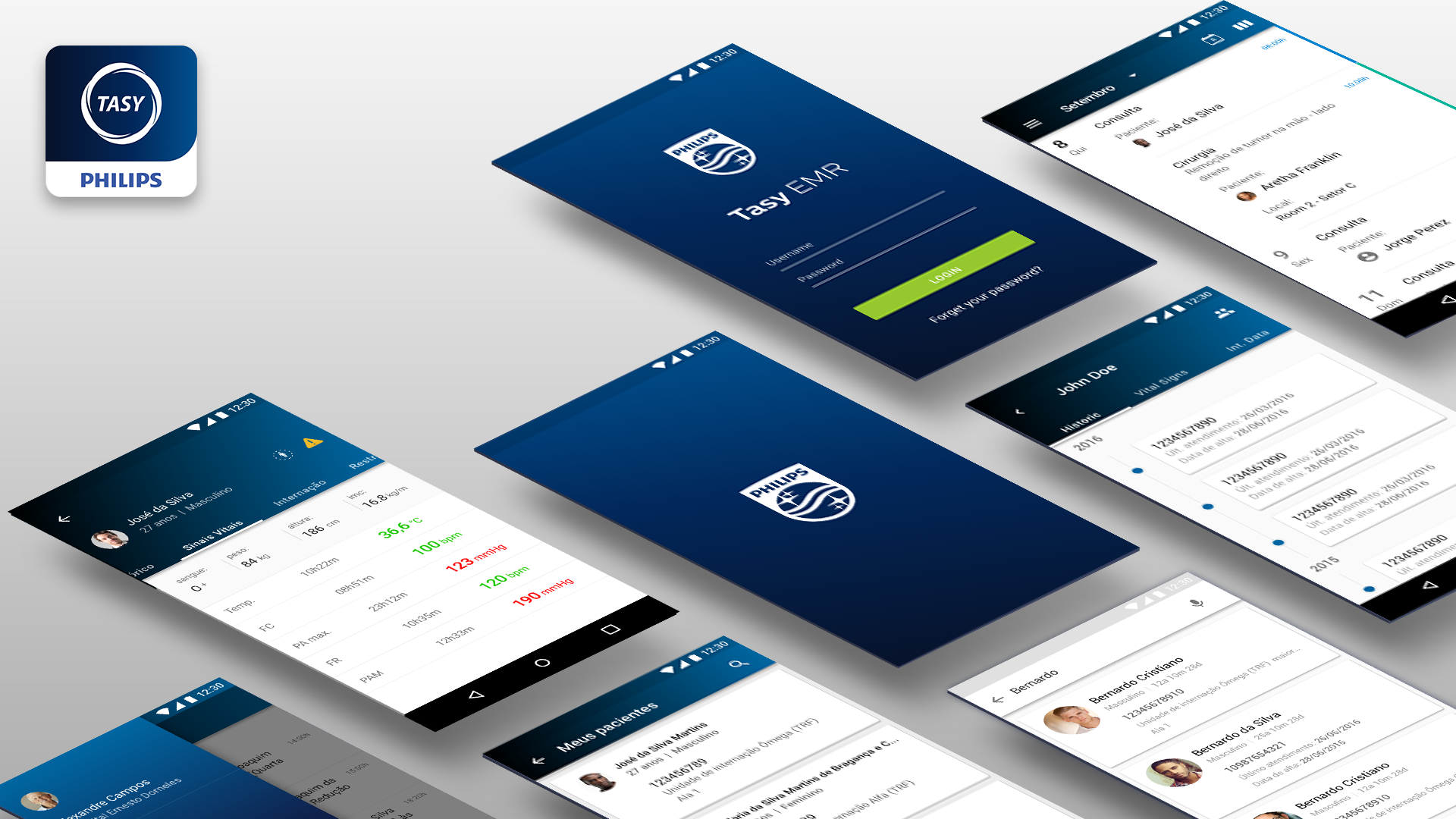
The app was fully connected with the Tasy desktop version. The physicians could see patient information changing in real-time from their own mobile devices. For compliance reasons, we defined a specific range of locations where the app could be accessed. The session was closed, and the physicians couldn’t login into the app out of 100m away from the range of the hospital network.
The first version of the project was delivered on time and presented at Philips Connect day 2017, the most significant event on the health tech in Latin America.

Results
Unfortunately not many data could be collected from this project due compliance restrictions about the medical record. The only information possible was the number of active sessions, which we got 500k monthly active users after 6 months of release
After 1 year of release the Research team collect some qualitative numbers from doctors. The survey identified that doctors had a better overview of their patients treatment and a saved time during emergency.

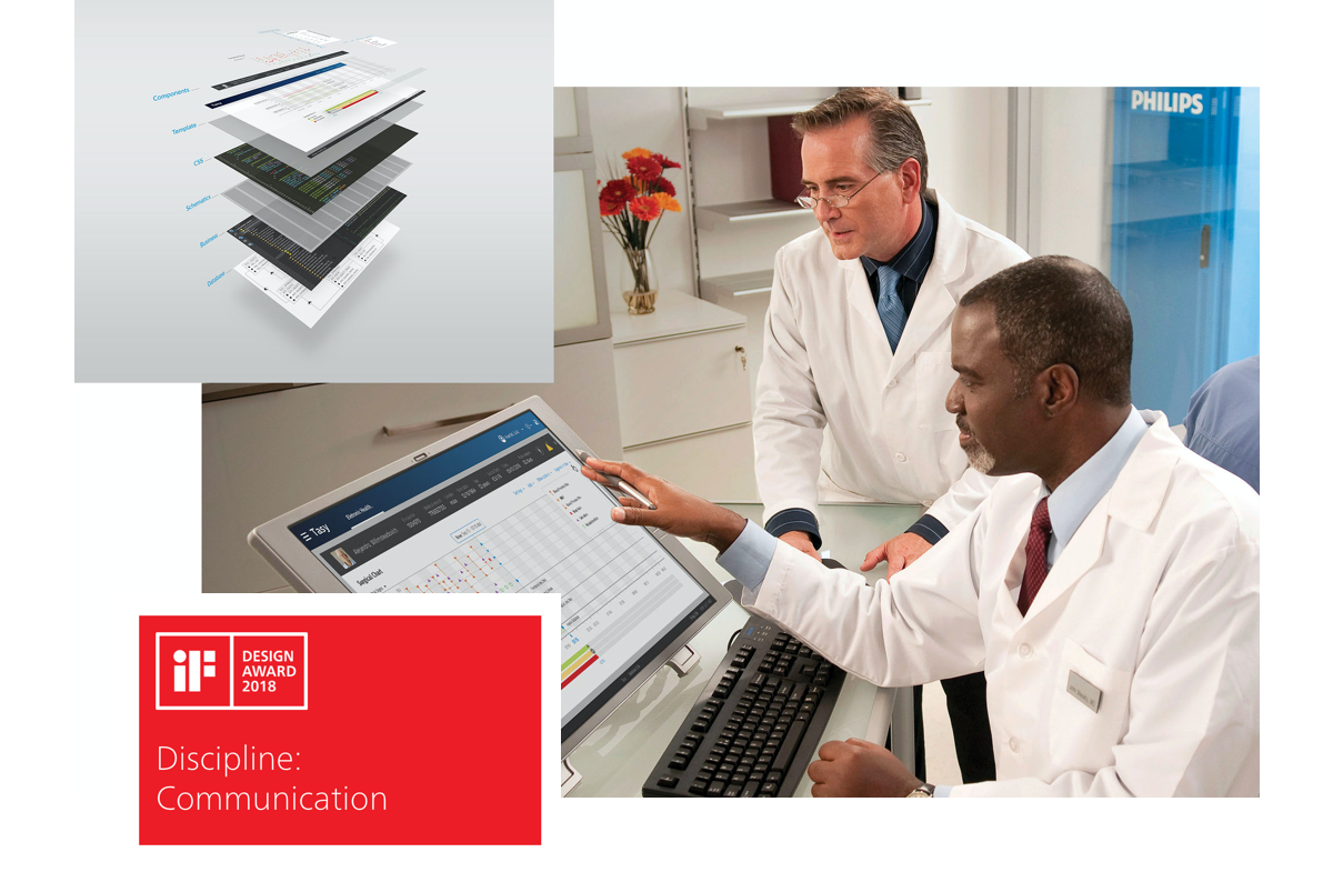
IF Design Award - 2017
Another great achievement of this project was the recognition by the renewed award IF Design of 2017.
Learnings
POLITICS IN BIG ORGANIZATIONS
Philips is a big organization so we had to constantly fight to focus on the real problem and not fall into many different strategies.
HOSPITALS ARE VERY COMPLEX ENVIRONMENT
I figured out hospitals are such a complex and hierarchical environment. Infinite actors and different moments. I took a long time to understand the basics.
MINIMAL CHANGES COST LIFES
In emergency the time is counted in seconds. Have access to contextual information on the right time is crucial.

Recommendations
I had the opportunity to work with Hanry at Philips as a Designer Lead of the Tasy mobile initiative. Hanry nailed every step of the project showing and ownership and confidence. He not only a senior designer but also an excellent team player involving stakeholders and project members at the right time.
Victor Montalvão - Lead designer at Xelo