My Role
As Product Design Lead, I managed the project from problem definition to launch. I worked with cross-functional teams, used design thinking to guide product decisions, led user research, created and validated wireframes and prototypes. I partnered with engineering during delivery, set KPIs with the team, and tracked performance to drive improvements.
Tools
Figma, Figma make, Miro, ChatGPT, Userlytics, Userpilot, Mouseflow.
About Uptrends
Uptrends is a SaaS observability platform by ITRS Group that helps teams monitor website performance, uptime, and user experience across global locations.
Challenge
Increase the return rate of trial users (second login) from 44% to 66% by delivering a tailored first-time experience for website monitoring users.
In Q4 2024, Uptrends defined its 2025 OKRs. One of the most critical goals was improving trial activation, measured by the percentage of users who returned for a second session.
This metric directly impacts product-led growth, influencing conversion, retention, and overall acquisition efficiency.
Identifying the problem
To better understand why users were dropping off, I introduced an exit survey using Userpilot, triggered when users deleted their accounts. With the CEO's approval, we offered a €50 incentive to increase participation. The response rate was strong and provided valuable qualitative insights.
A consistent pattern quickly emerged:
Users felt overwhelmed and didn’t know what to do when they first entered the product.
188 users answered the exit survey. I spoke with some customers, and I found a pattern: users got really confused about what to do after activating their accounts. They did not believe Uptrends would be able to solve their needs, and they did not see the value in testing the platform.
To validate this, I analyzed session recordings using Mouseflow. The behavior confirmed the problem:
Users landed on an empty dashboard.
No immediate feedback or visible data.
Rapid navigation between pages in search of meaning.
Data eventually appeared, but too late to recover first impressions
At the same time, I identified a mismatch between user intent and product experience. Users coming from API monitoring campaigns were entering a website-monitoring-oriented dashboard, leading to confusion and disengagement.

Focusing the Opportunity
Rather than trying to solve for all users, we made a deliberate decision to narrow our focus to the largest and most critical persona: Operators.
Different user groups come to Uptrends with very different expectations. API users, developers, and operators each look for distinct types of data and workflows. Designing a single experience to satisfy all of them was creating unnecessary complexity and weakening the first-time experience.
By focusing on operators, we were able to design a dedicated dashboard with meaningful, relevant data from the start, tailored to their core needs and decision-making process.
This was a critical step. It allowed us to reduce ambiguity, increase clarity, and deliver a more focused experience that better demonstrated the product’s value during the first minutes of use.
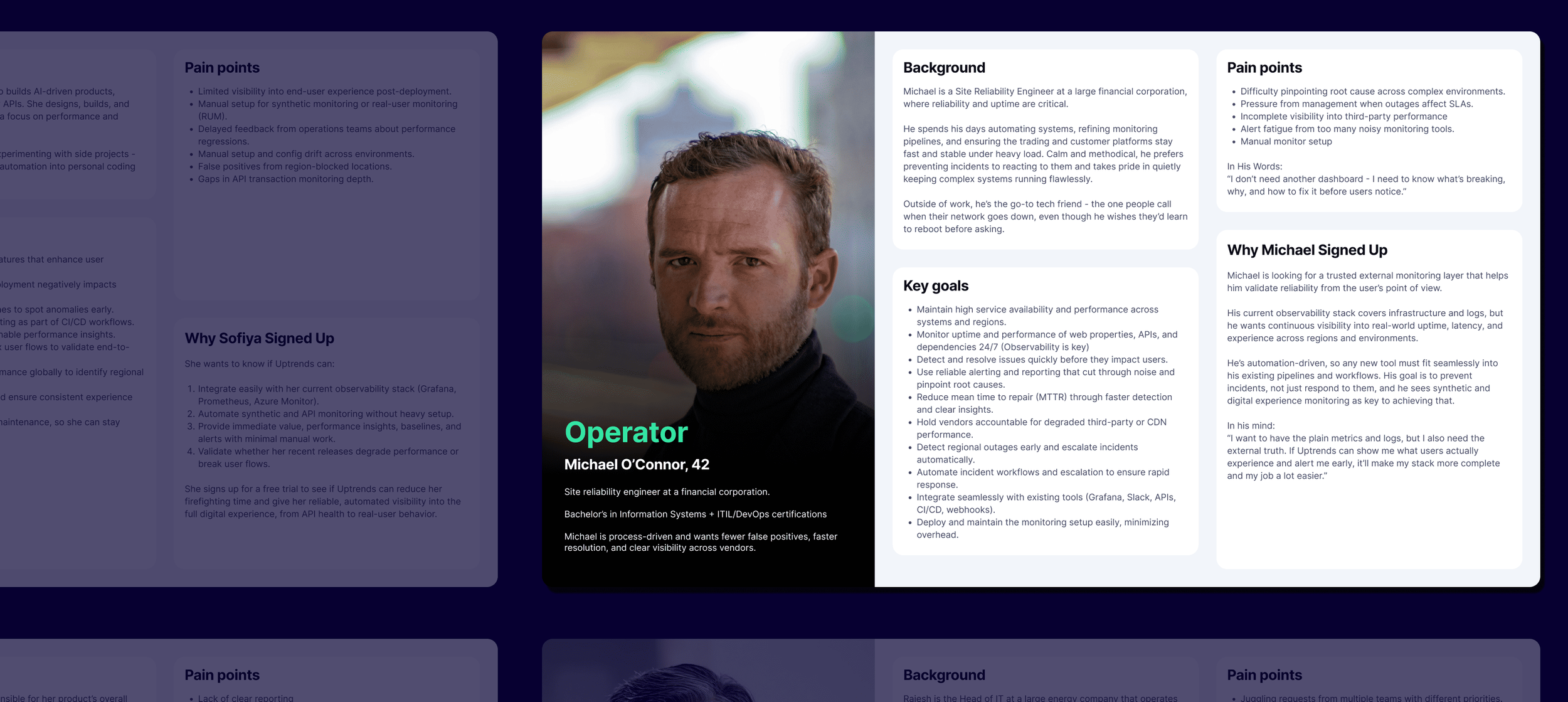
Operators are the biggest audience of Uptrends. They are the ones who setup platform and work monitoring incidents across the world.
Aligning the organization
To tackle this problem, I led a cross-functional design sprint involving product, engineering, sales, and support.
With support from the CPO, we aligned the team around a single challenge:
How might we use the first five minutes to help operators get the most value from Uptrends?
We decided to focus on the most critical moment in the journey: The very first screen users see after landing in the product.
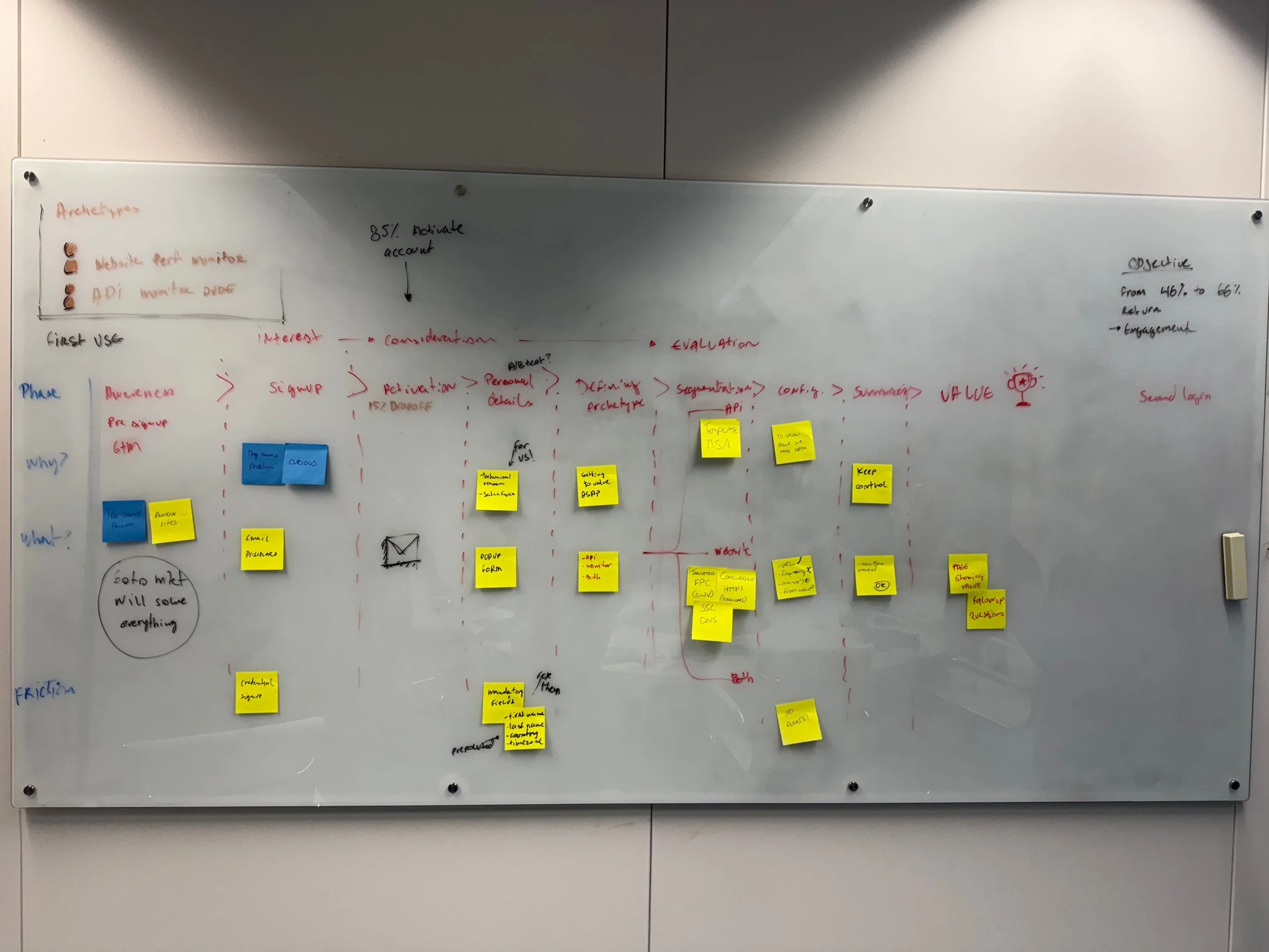
Whiteboard exercise with executives in house. I facilitated the conversation, uncovering the main steps of the journey before landing on the product.
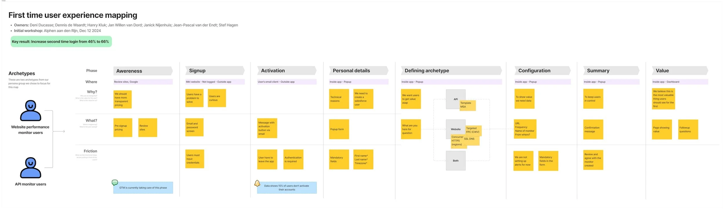
After the exercise I summarized the findings in one document to gather alignment.
Guiding Principles
We defined three principles to guide the solution:
Minimum setup
Trial users are often evaluating multiple platforms at once and have limited patience for configuration.
Uptrends has a key advantage: it can generate meaningful monitoring data by simply analyzing the URL provided during activation. This allows the system to begin collecting uptime, performance, and regional data almost immediately.
We leveraged this capability to ensure users could see real value within seconds, without additional setup.
Real-time trust
Operators must immediately trust that the system is active and reliable. Early visibility of live data is essential.
Data exploration
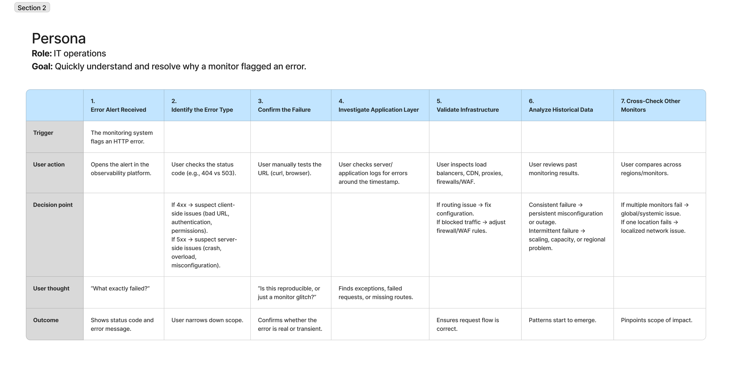
The experience should not stop at visibility. Users should be able to explore, investigate, and identify root causes directly from the main dashboard.
Defining the Experience
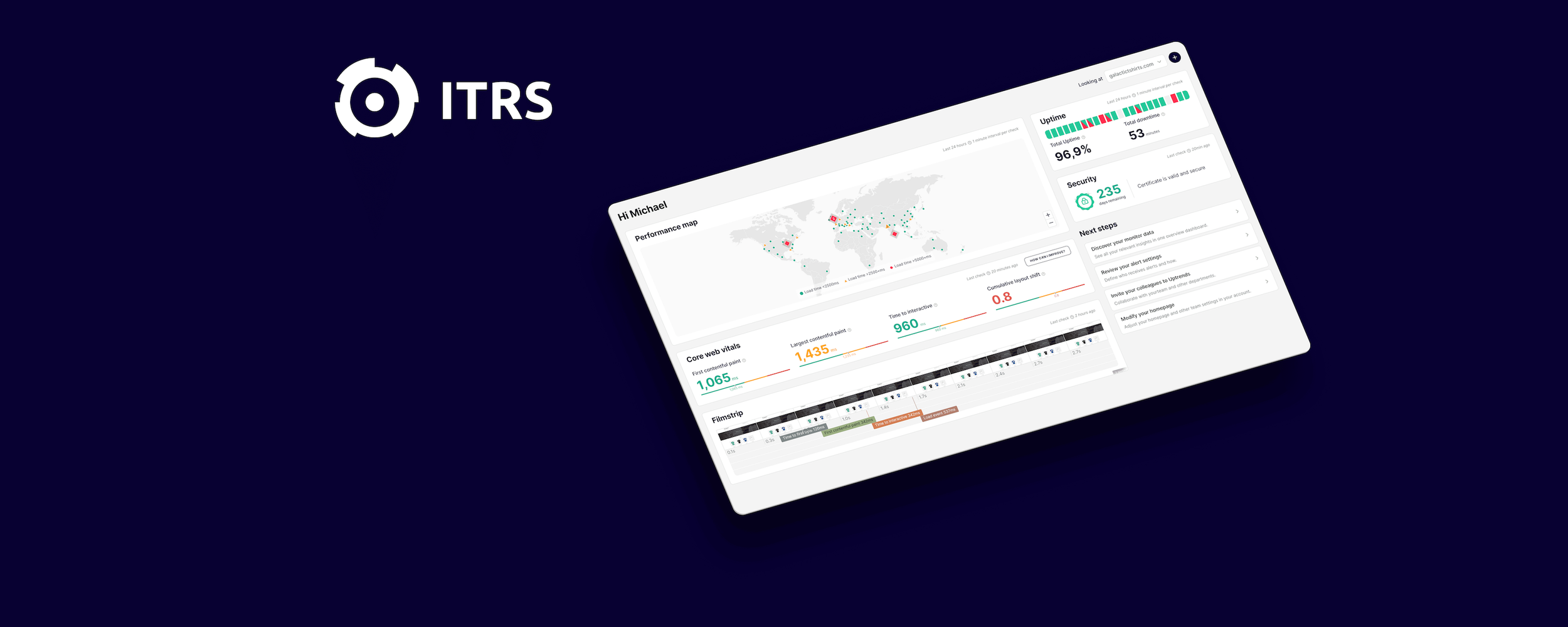
The outcome of the sprint was ambitious: create a new dashboard tailored to operators, focused on immediate clarity and actionable insights.
We also made a key product decision, renaming the dashboard to Site Health. The previous name, Account Overview, was too generic and failed to communicate value. The new name directly reflects the operator’s primary goal:
Understanding the current health of their monitored systems
This small but intentional change reinforced the dashboard as the central decision-making surface.

Exploration and Design
The sprint produced multiple concepts, sketches, and whiteboard explorations focused on:
What operators need to see first
What signals indicate “system health”
How to balance overview vs drill-down
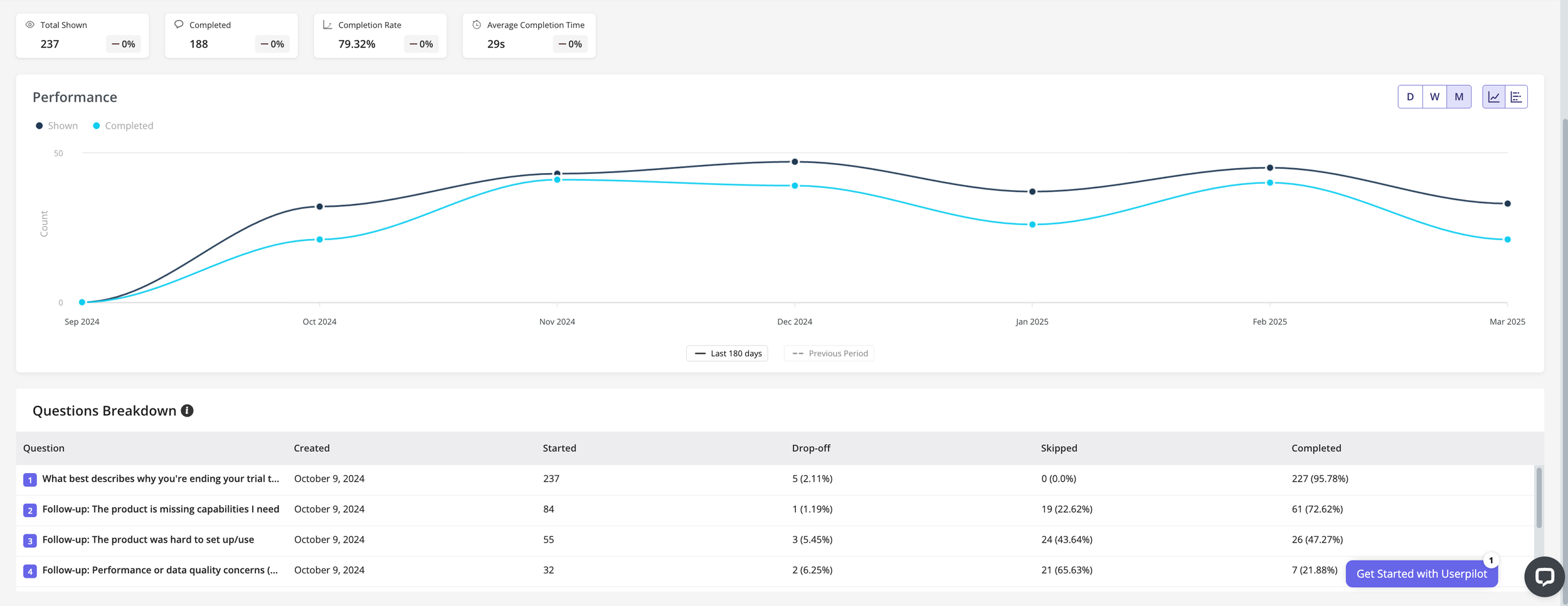
I translated these into interactive Figma prototypes and ran desirability tests with experienced customers.
Feedback was consistently positive, especially around:
Clarity of information
Sense of “live system.”
Ease of exploration

First round of conversation where we defined the main tasks the dashboard should accomplish.
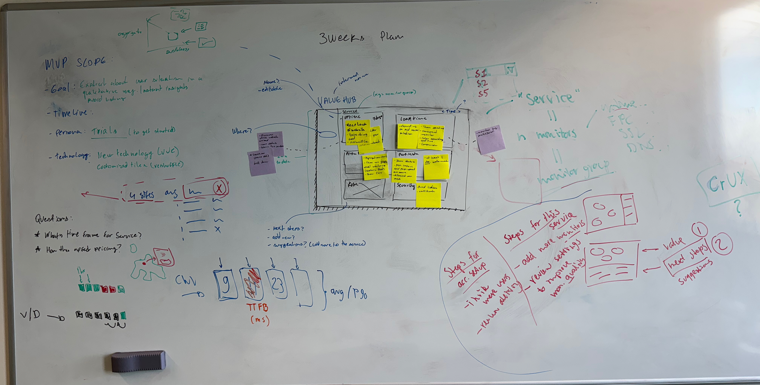
Evolution of the wireframes with some database definition, and brief MVP scoping.

On the third meeting we had a basic structure of widgets that gives the operator a good picture of the health of their URL.
Designing for Signal and Exploration
Designing the dashboard required balancing:
High data density
Limited screen space
Immediate readability
Each widget needed to:
Provide meaningful insight at a glance
Enable deeper investigation when needed
At the same time, engineering constraints required rebuilding parts of the dashboard engine, which we addressed in parallel with design iterations.
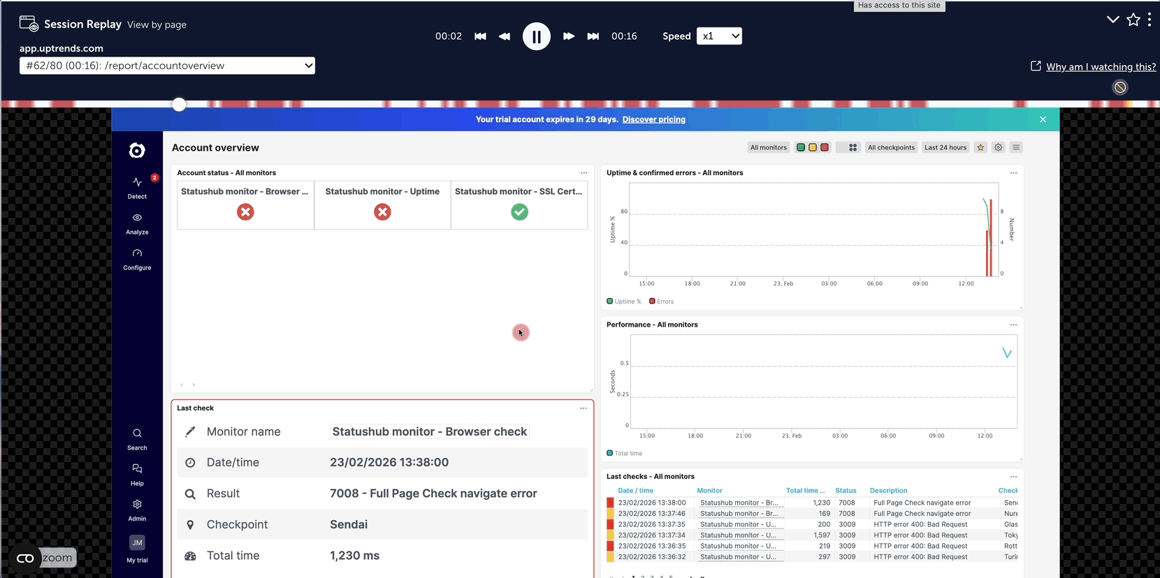
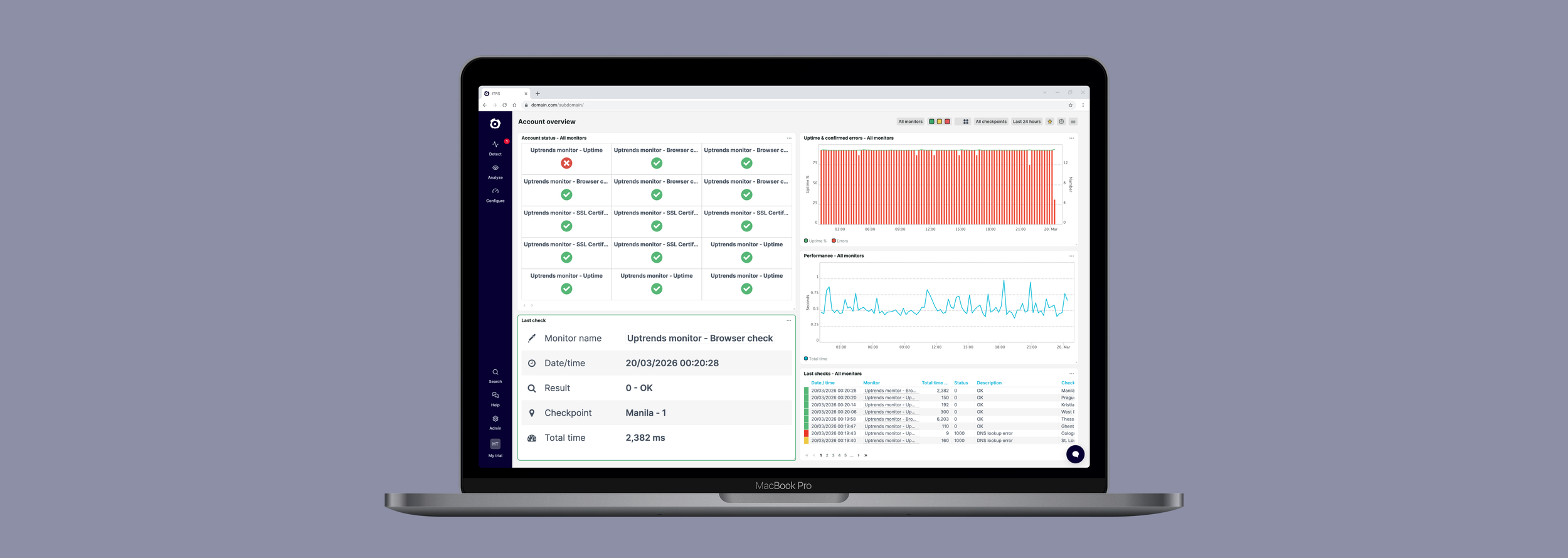
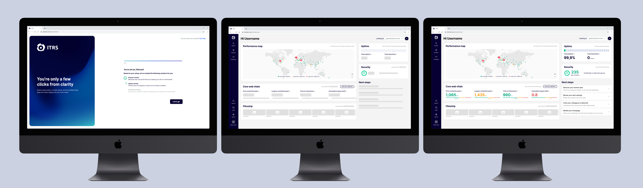
Old account overview
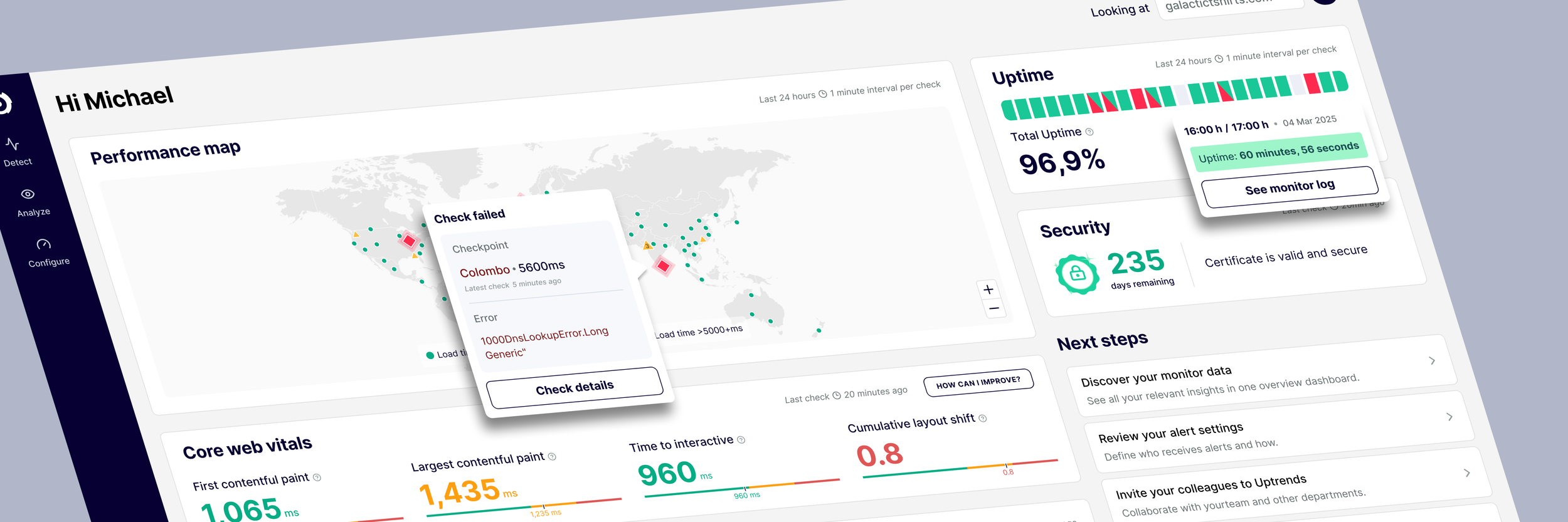
New first user experience dashboard

The Turning Point: When the Solution Failed
After launching the MVP, we ran an A/B test comparing the new dashboard with the existing experience.
The result was unexpected:
The new dashboard performed worse than the old one.
Instead of rolling back the solution, I led the effort to understand why.
Root Cause
The issue was not the dashboard itself — it was who we were testing it on.
We were measuring performance across a mixed audience:
Operators and non-operators
Website monitoring users and API monitoring users
The experience was optimized for a specific group, but we were evaluating it against everyone.
Fixing the Funnel
To address this, we implemented the segmented onboarding flow described earlier.
This allowed us to isolate the relevant audience and measure the dashboard’s performance accurately.
Once segmentation was in place, the results became clear:
Operators engaged significantly more with the new dashboard
Users spent more time interacting with widgets
Investigation shifted from navigation menus to the dashboard itself
Activation Flow Improvement
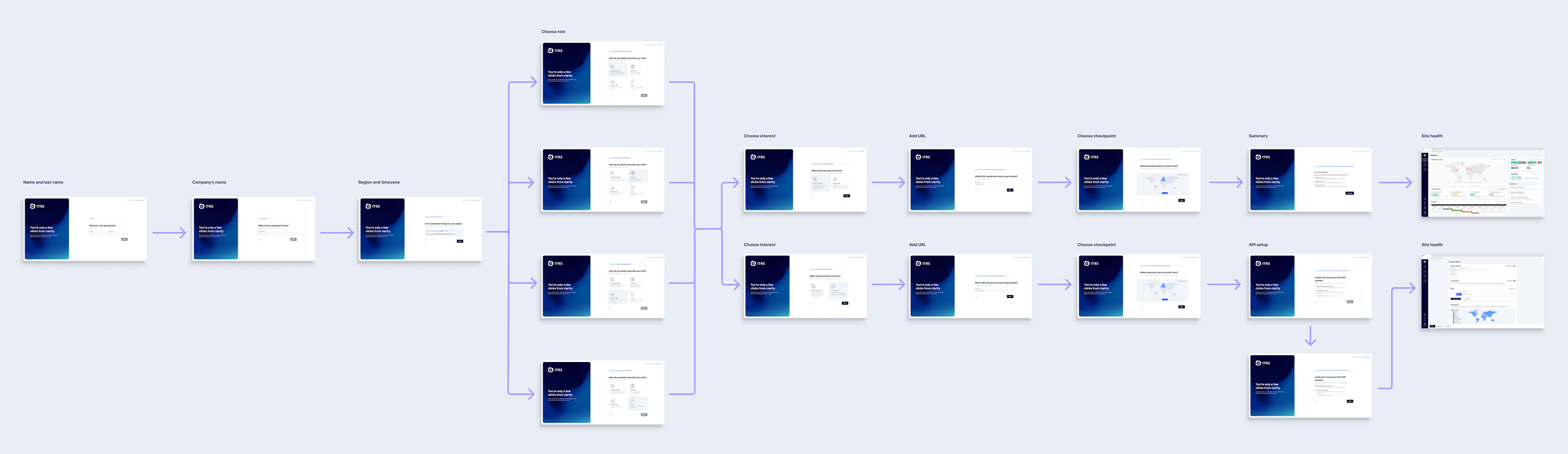
We introduced a critical change in the onboarding flow:
Users were asked to select:
Their job role
Their monitoring goal (e.g. website vs API monitoring)
This allowed us to:
Segment users more effectively
Direct them to the most relevant experience
Analyze behavior with greater accuracy
For example, Operators focused on website monitoring were guided to the new Site Health dashboard.
Activation flow - Before redesign
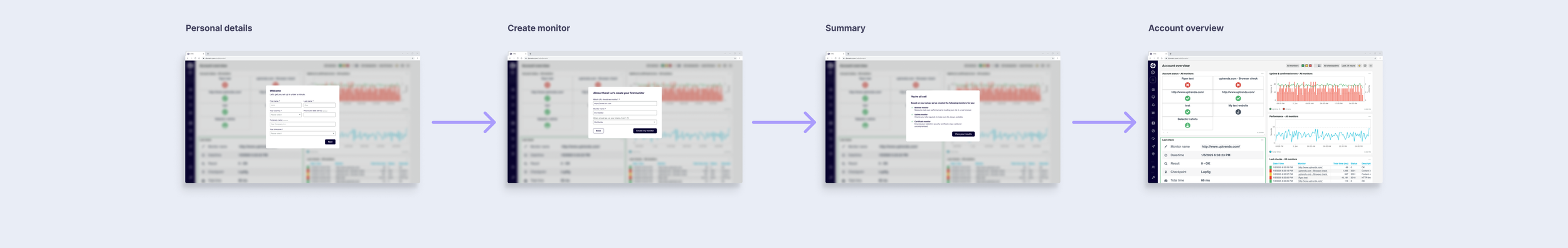
Activation flow - After redesign
Reducing First-Impression Friction
We identified one remaining issue: data latency on first load.
Some users experienced delays of up to 10 seconds before seeing data, which created doubt about whether the system was working.
We introduced two key improvements:
Onboarding delay animation
A short transition ensured data was available when users reached the dashboard.
Skeleton loading states
These provided immediate visual feedback that the system was actively loading data.
These changes reduced the bounce rate by approximately 20%.
Results
The Site Health dashboard became the primary interface for operators.
Behavioral impact
Increased engagement with dashboard widgets
Reduced reliance on navigation
More direct investigation workflows
Business impact
Q1 2025: 42% return rate
Q2 2025: 49%
Q3 2025: 55%
This represents a +13 percentage point increase in second-login rate within two quarters of launch.
Reflection
This project reinforced that activation challenges are rarely solved through UI alone.
The biggest impact came from aligning:
First-time experience
User segmentation
Value delivery timing
By ensuring users experienced meaningful value within the first minutes — and tailoring that experience to their intent — we were able to significantly improve engagement and retention.